


01
Naming and concept
Developed the name and brand concept as a foundation for the identity and its applications.
One identity, from naming to launch.
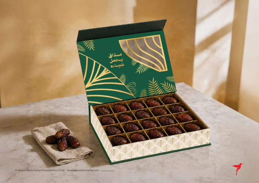
WADAA is a Saudi dates brand. Sara’s work covered naming, visual identity, stationery, packaging, website design and development, and the visual system for its social launch.
The project focus was to carry one recognizable identity across physical and digital applications, from product packaging to website screens and social templates.
Developed the name and brand concept as a foundation for the identity and its applications.
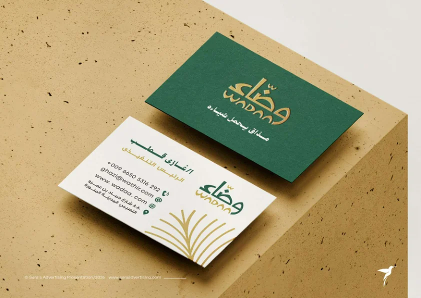
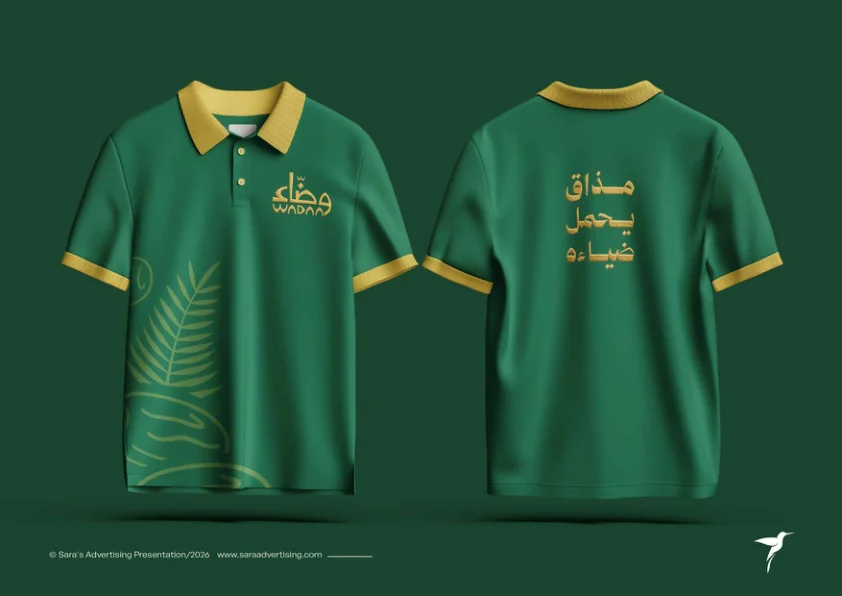
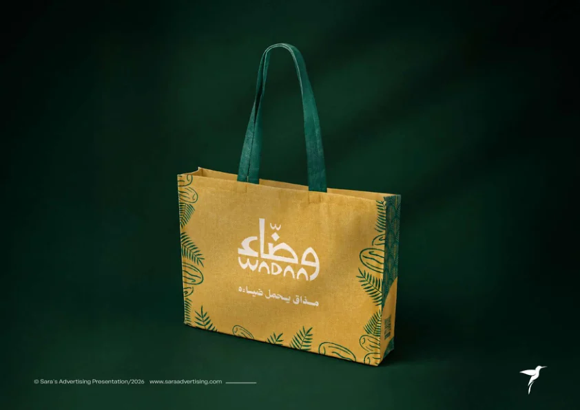
Created the logo, colour palette, typography and visual elements, then applied them across stationery.
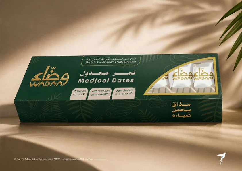
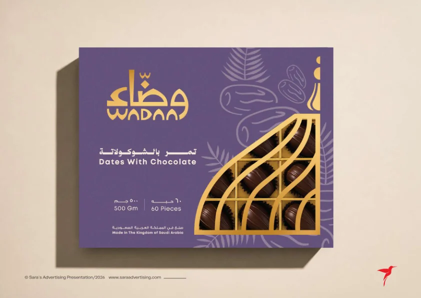
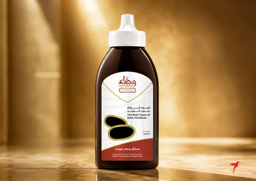
Designed a family of packs for different product lines within one visual identity.
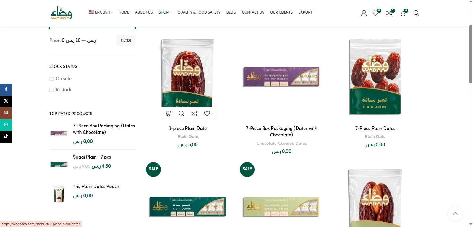
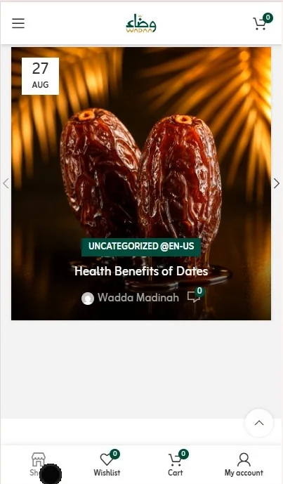
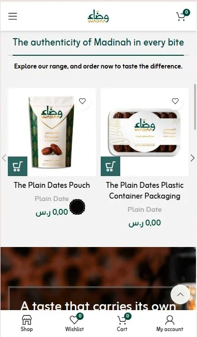
Translated the identity into product presentation and brand-story pages, with desktop and mobile layouts.
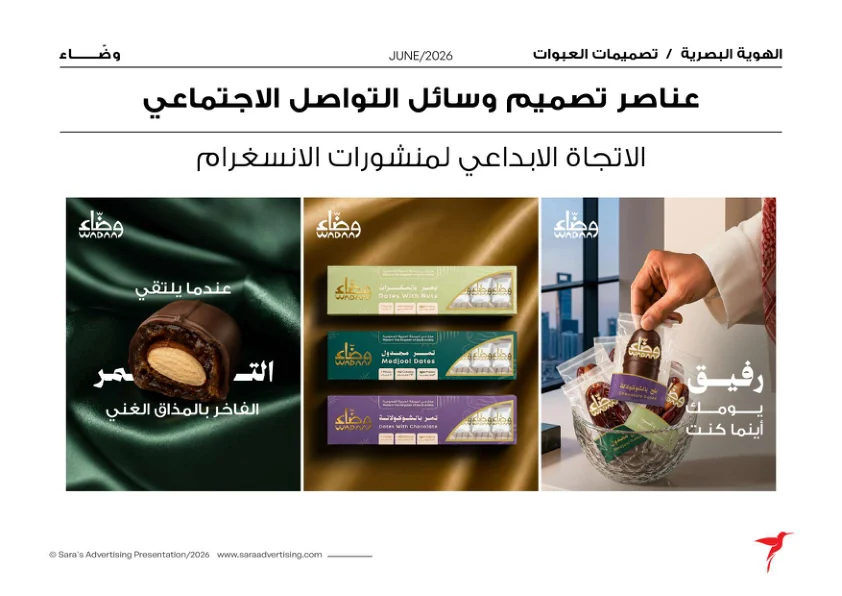
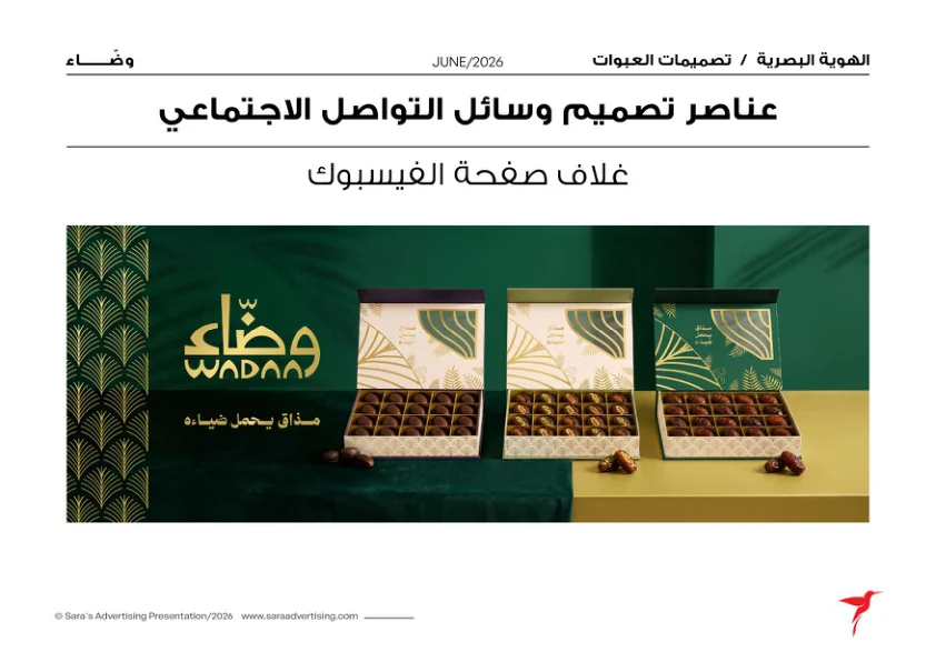
Prepared a visual direction and templates that connect the brand’s social presence with its packaging and website.
⤢⤢ ⤢⤢
⤢⤢ ⤢
⤢ ⤢
⤢ ⤢
⤢ ⤢
⤢ ⤢
⤢ ⤢⤢
⤢⤢ ⤢
⤢ ⤢⤢
⤢⤢ ⤢
⤢Click any image to view it in full.
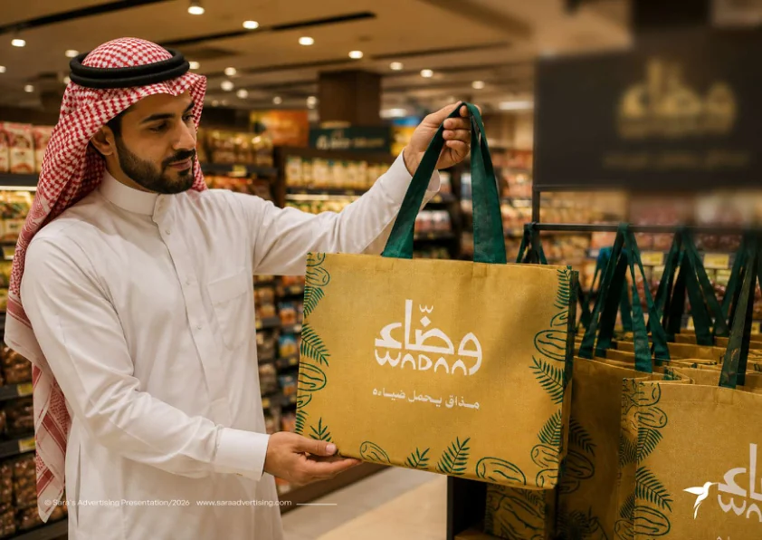
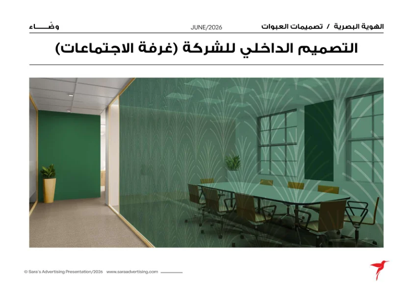
The presented identity draws on Madinah and palm imagery, expressed through the logo, patterns and a palette led by green and gold.
Packaging variations differentiate product lines while retaining common identity elements. Those same elements carry into stationery, the website and social templates.
The work presented brings naming, identity, packaging, website design and social launch assets together under one brand direction.
WADAA is shown at the pre-launch stage. This case study documents design outputs and includes mockups; it does not report sales or campaign-performance results.
Share your business, location, required services and launch timing with Sara.