
Taste starts
with the eyes.
Before the first taste comes the first look. We shape food and beverage brands through strategy, identity and packaging that make the product’s character visible.
Let’s build your food brand ↗Nature in the idea.
Character in the identity.
Consistency in the details.
THE PACKAGING↗
Give good food
a brand with character.
A pack is often the first conversation your product has with a customer. Our role is to make that conversation clear, recognisable and true to the brand—then carry it into the rest of the experience.
A reason to exist.
Define the positioning, values and message that the identity needs to express.
A recognisable world.
Connect the logo, colour, type and patterns so each application feels part of one brand.
A product brought to life.
Translate the system into packaging, brand touchpoints and product-led creative content.
One idea.
A whole brand system.
Aura is the featured branding and packaging project. Its identity and packaging presentations centre on olive oil and honey; three additional AI films extend the content into honey, pistachios and dried fruits. The creative direction connects nature, perceived quality and a coherent product family.
How do you make quality visible before the first taste?
The identity has to express the product’s character before anyone opens the pack. For Aura, the starting point was a nature-inspired brand ambition, supported by values of quality, innovation, integrity, sustainability and putting the customer first.
Give every application the same underlying logic.
We developed a connected identity: a nature-led symbol, green and gold visual direction, typography, bilingual tagline, patterns, stationery and packaging applications. Each piece belongs to the same family while adapting to its own purpose.
A brand that can move between formats.
The portfolio shows how the system translates from a small label to a bag, a sign, a delivery vehicle concept and a product film. The result is a documented identity system with a family of packaging and application concepts, supported by three product films. The portfolio lets a prospective client see the breadth of the creative work and how its pieces relate.
More than
a logo reveal.
Follow the brand from its central idea to the details that make it usable.
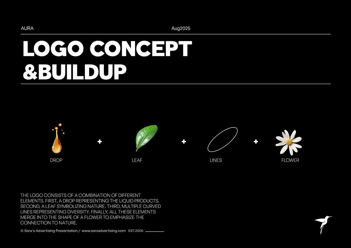 The symbol: nature translated into form↗
Start with what the brand should stand for.
The symbol combines a drop, a leaf, curved lines and a floral reference. Together, they create a visual connection with natural ingredients and the brand’s food category. The point is a usable visual idea that can carry across packaging and communication.
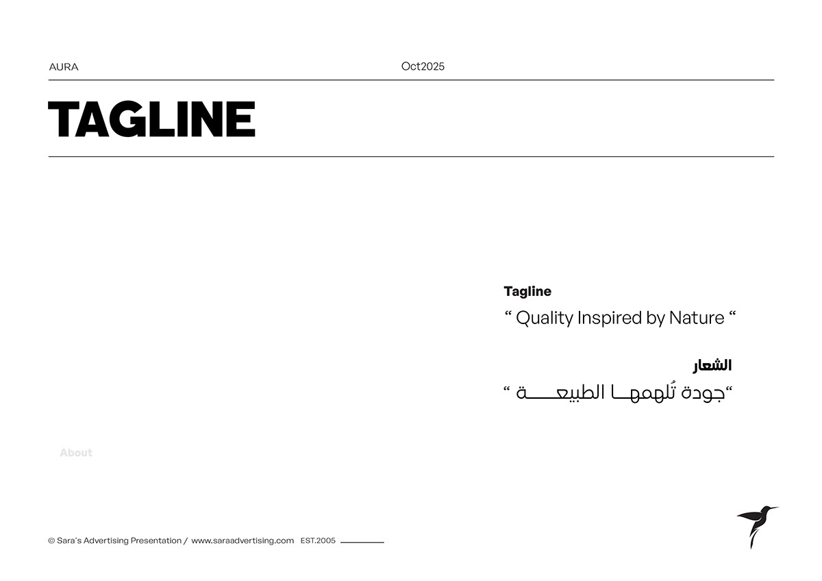
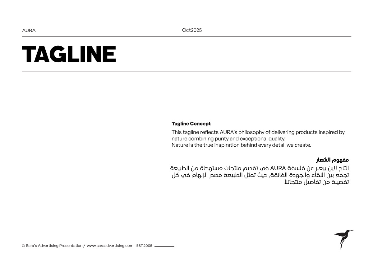
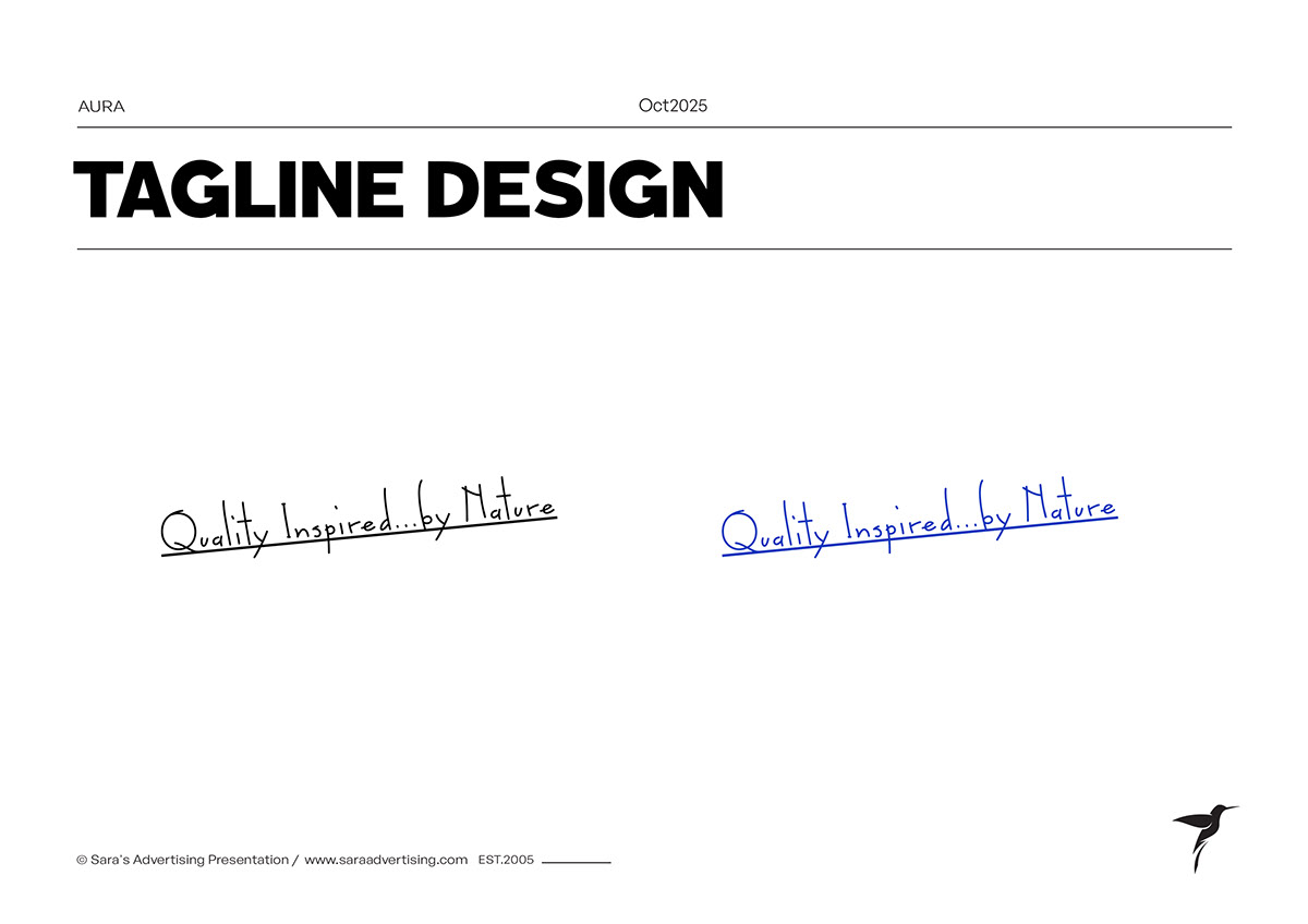
The verbal identity combines quality and prestige with imagination, confidence, honesty and responsibility. The tagline gives that direction a concise expression:
Quality Inspired by Nature
جودة تلهمها الطبيعة
Build rules the brand can keep using.
The green and gold direction, logo variations and type hierarchy create continuity across different sizes and backgrounds. Vertical, horizontal and monochrome versions give the identity practical options instead of relying on a single composition.
Typography separates brand expression from supporting information. Colour gives the range a recognisable visual anchor. The guidelines document proportions and variations so future applications can follow the same system.
Make the identity work beyond the front label.
Patterns extend the symbol into a repeatable language. The system appears across shopping bags, stationery, folders, apparel, signage and a delivery vehicle concept. A customer sees the same brand cues at different moments, rather than unrelated designs.
For an F&B business, the practical lesson is to define the application list early. A label, takeaway bag and facade have different reading distances, surfaces and information needs. The core identity stays coherent; the composition adapts.
A visual language that keeps working when the logo gets smaller.
The Aura presentation develops several pattern routes: looped-symbol repetition, a droplet-inspired repeat, a wordmark repeat and floral or botanical constructions. These give the identity more than one way to fill a surface, frame a product or add texture.
The role of a pattern is practical as well as expressive. A small label needs restraint and legibility; a shopping bag offers room for a broader brand gesture. The system supplies visual material that can be adapted to those different needs without creating a new identity each time.
For a similar F&B brief, we define where the pattern leads, where it supports and where the product information needs a quieter background.
The brand has to live in the details, too.
Cards, letterheads, envelopes and presentation folders bring the identity into business communication. Bags, clothing, signage and the vehicle concept take it into customer-facing environments. Each format asks a different question about scale, placement, contrast and material.
The portfolio explores embossing, fabric, illuminated signage and print applications to show how the same identity behaves in different contexts. These are design presentations and concepts; their purpose here is to demonstrate the system’s flexibility.
For your own project, the application list becomes part of the brief. We identify what the business actually needs at launch, what can follow later and which artwork or production specifications must be prepared for implementation.
One brand.
Different products. Different packs.
Food packaging has two jobs: express the brand and help people understand the product. Aura’s concepts show the identity adapting to bottles, tins, canisters and jars.
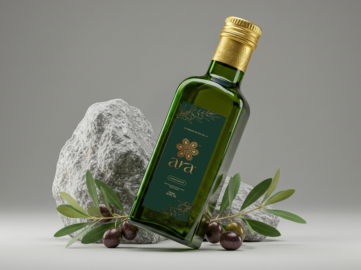 Olive oil — bottle presentation↗
Recognisable at range level.
Specific at product level.
The olive-oil bottle and tin use the same brand language across different pack structures. The honey jar and canister bring that identity into another category. Green, gold, the wordmark and the symbol tie the range together while each format gets its own layout.
When we scope food packaging, we look at the product range, information hierarchy, format, variant recognition and production requirements together. The artwork must have a clear role at every scale, from the hero image to the detail a customer reads up close.
Same identity.
A different job for every format.
Adapt the composition.
Keep the brand recognisable.
The bottle and tin share the Aura wordmark, symbol and green-and-gold direction. Their surfaces are different, so the brand cannot simply be pasted at one size onto both.
- Brand recognition
- Use the identity’s recognisable cues consistently across the range.
- Information hierarchy
- Give the brand, product name and supporting information clear roles in the layout.
- Format adaptation
- Review the available surface, proportions and viewing angle for each pack structure.
Shown: Aura’s olive-oil packaging concepts. Final artwork, dielines and mandatory product information are agreed within the production brief.
Extend the family.
Let the product have its own place.
The honey presentations bring Aura into another product category while retaining the family resemblance. The jar and canister show how a connected identity can support different pack structures.
- Range coherence
- Keep the wordmark, symbol and visual direction recognisable across categories.
- Product distinction
- Make the product category easy to identify within the shared brand system.
- Usable layouts
- Develop the composition around the pack’s shape and information requirements.
Shown: Aura’s honey packaging concepts. The presentation demonstrates the design system; it does not establish manufacturing or sales outcomes.
Shown here: design presentations and packaging concepts from the Aura portfolio. Production specifications and final label content are confirmed within the implementation scope.
Make the detail
move.
Three AI-generated product films created for Aura. Honey, pistachios and dried fruit become a study in texture, ingredients and product presentation.
An additional content workstream, extending the brand’s visual presentation into motion.
Let texture tell the story.
A product-led film brings the honey into a sensory setting. The creative task is to make a familiar product feel considered while keeping the pack recognisable.
Build around product character.
Ingredient detail and a controlled visual world give the product its own moment. The film becomes an extension of the brand’s visual direction.
Create a family of content.
Different products need distinct scenes, but the output should still feel connected. The three films show how a shared brand can support separate product stories.
Need more ways to present your food products?
Discuss AI product content ↗OPTIONAL / EXPLORE THE SOURCE DETAILThe complete Aura brand presentation
81 source pages: strategy, identity rules, patterns and application variants.
+
The complete Aura brand presentation
81 source pages: strategy, identity rules, patterns and application variants.
Every chapter.
Every source page.
All 81 pages from the available Aura presentation, organised into 10 chapters. Explore the thinking, construction, variations and applications in their original sequence.
Showing 12 of 81 pages
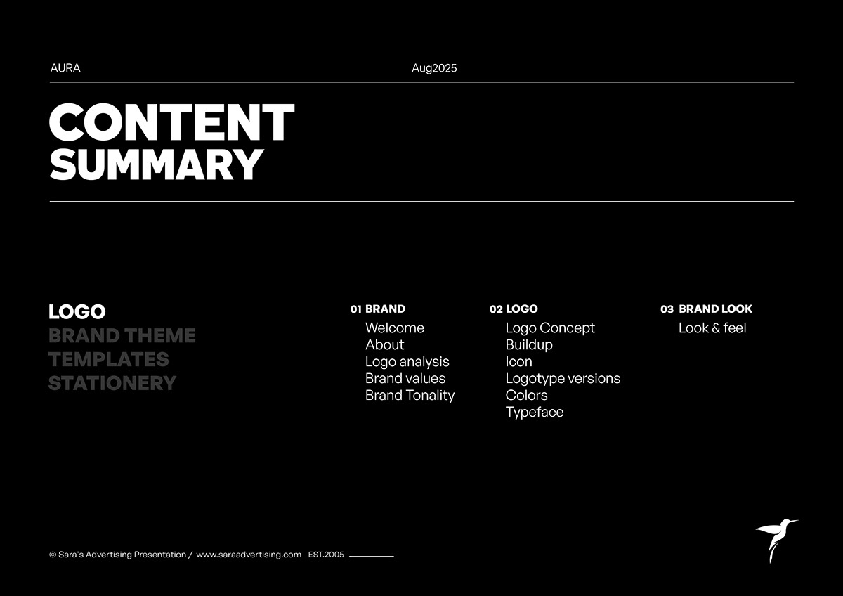 01Contents and deliverable map
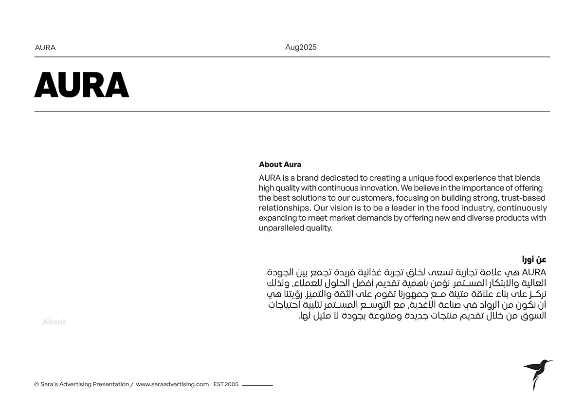 02About Aura
 03Brand values chapter
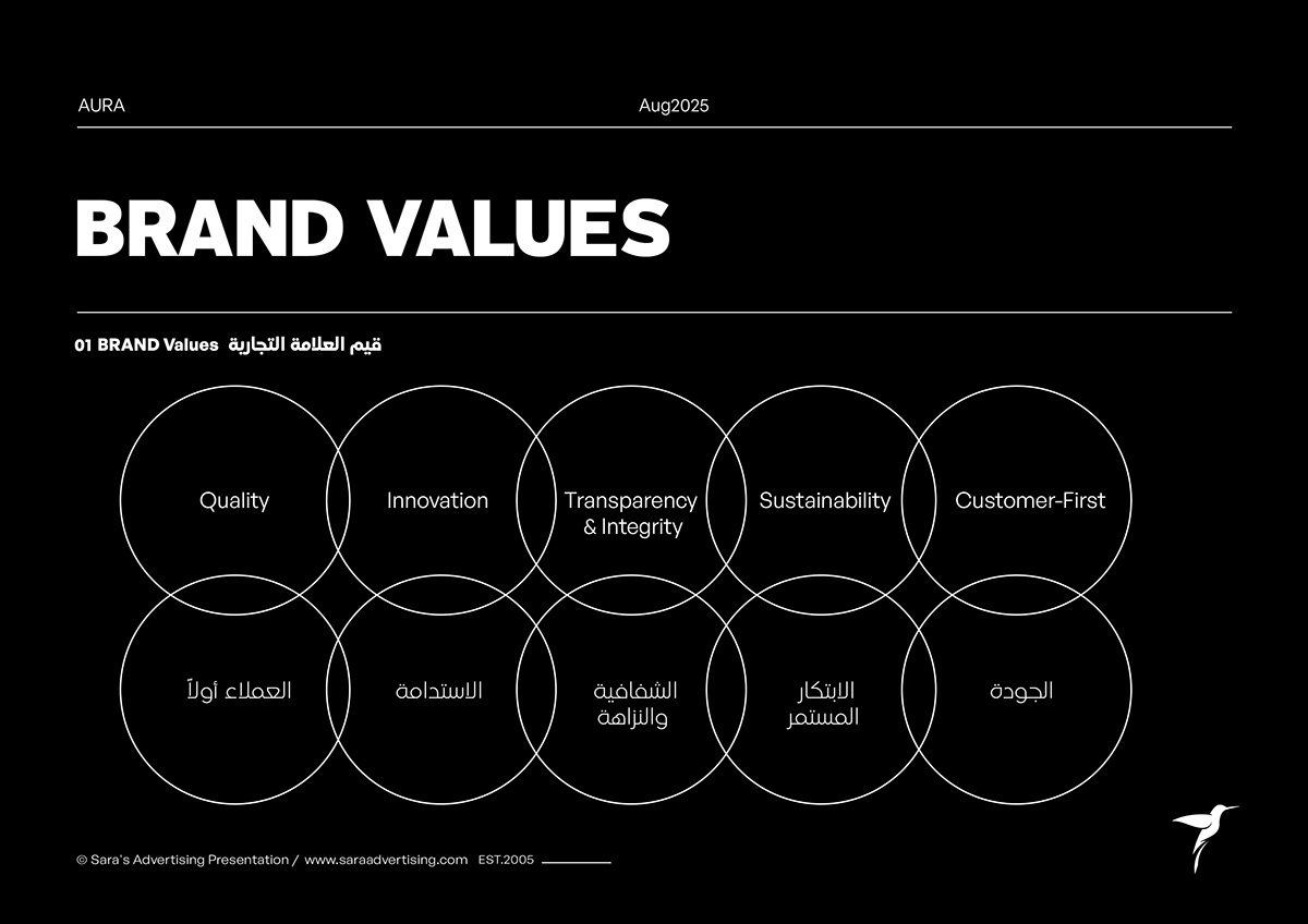 04The five brand values
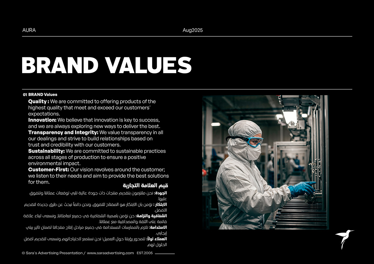 05Quality, innovation and customer focus
 06Tone of voice chapter
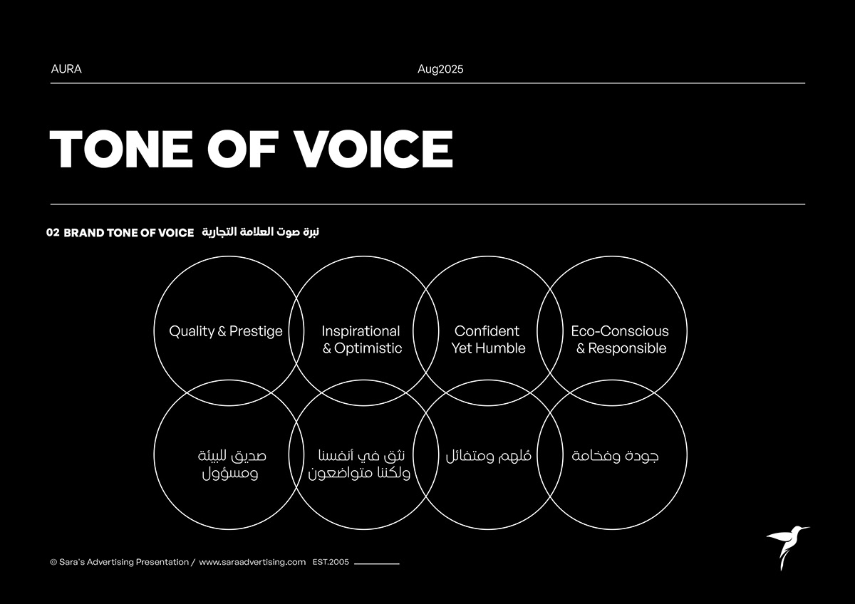 07Voice territories
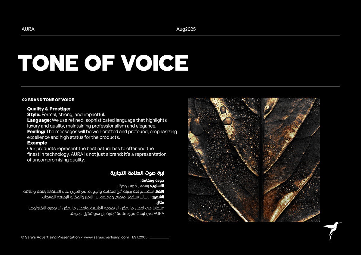 08Quality and prestige voice
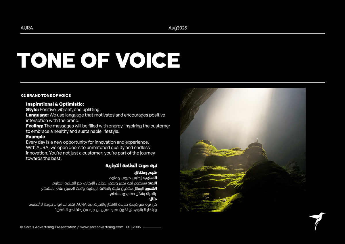 09Imagination and optimism voice
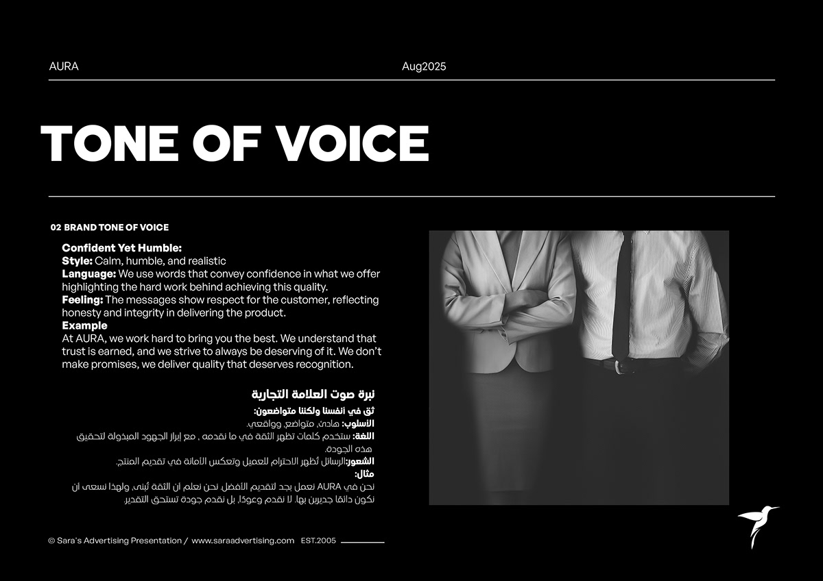 10Confidence and honesty voice
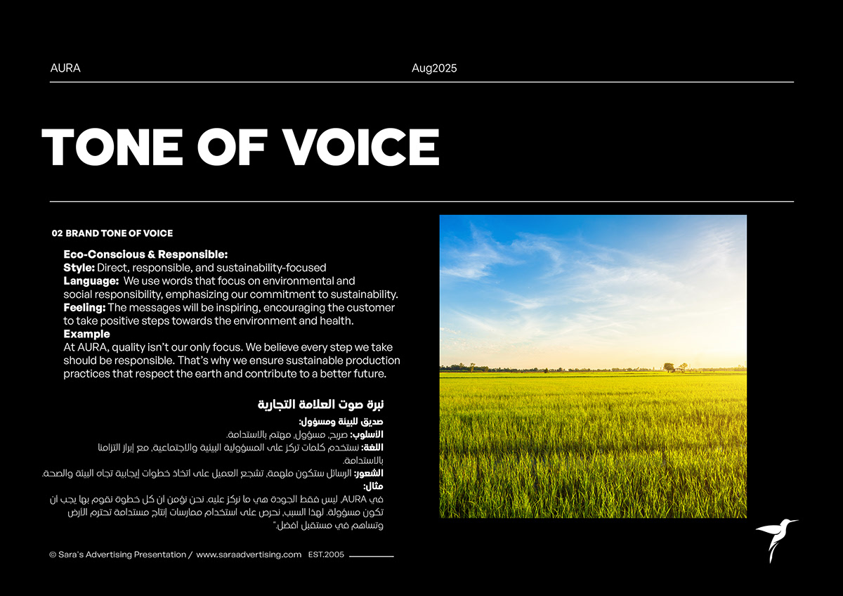 11Eco-conscious and responsible voice
 12Colour palette chapter
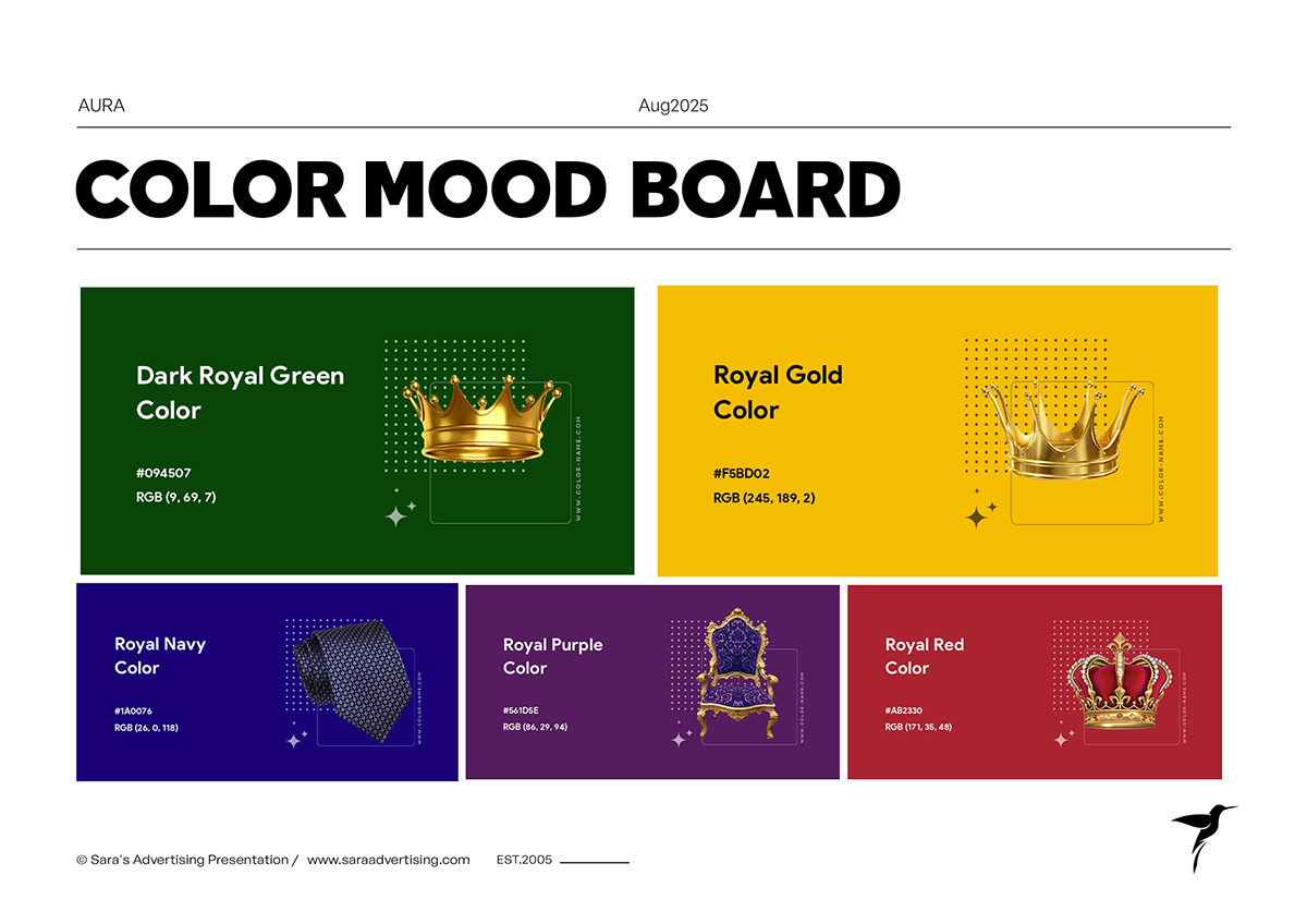 13Colour mood board
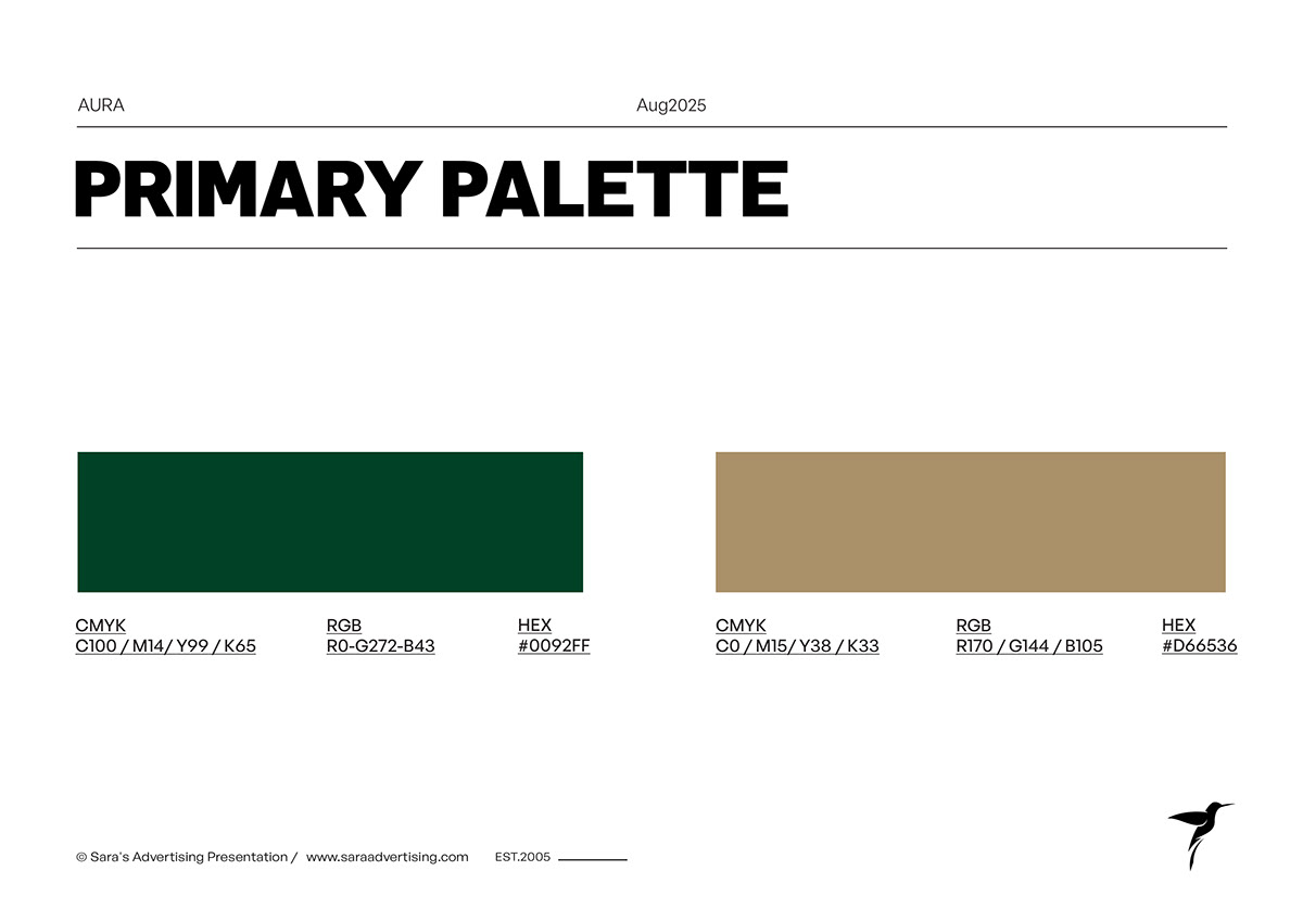 14Primary green and gold palette
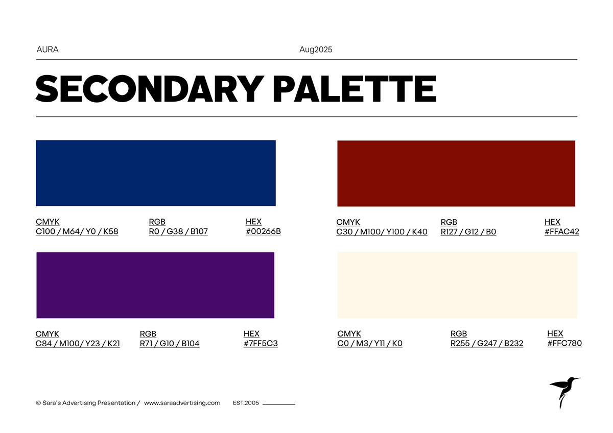 15Secondary accent colours
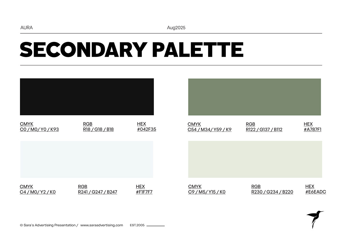 16Secondary neutral colours
 17Logo development chapter18Logo concept and construction
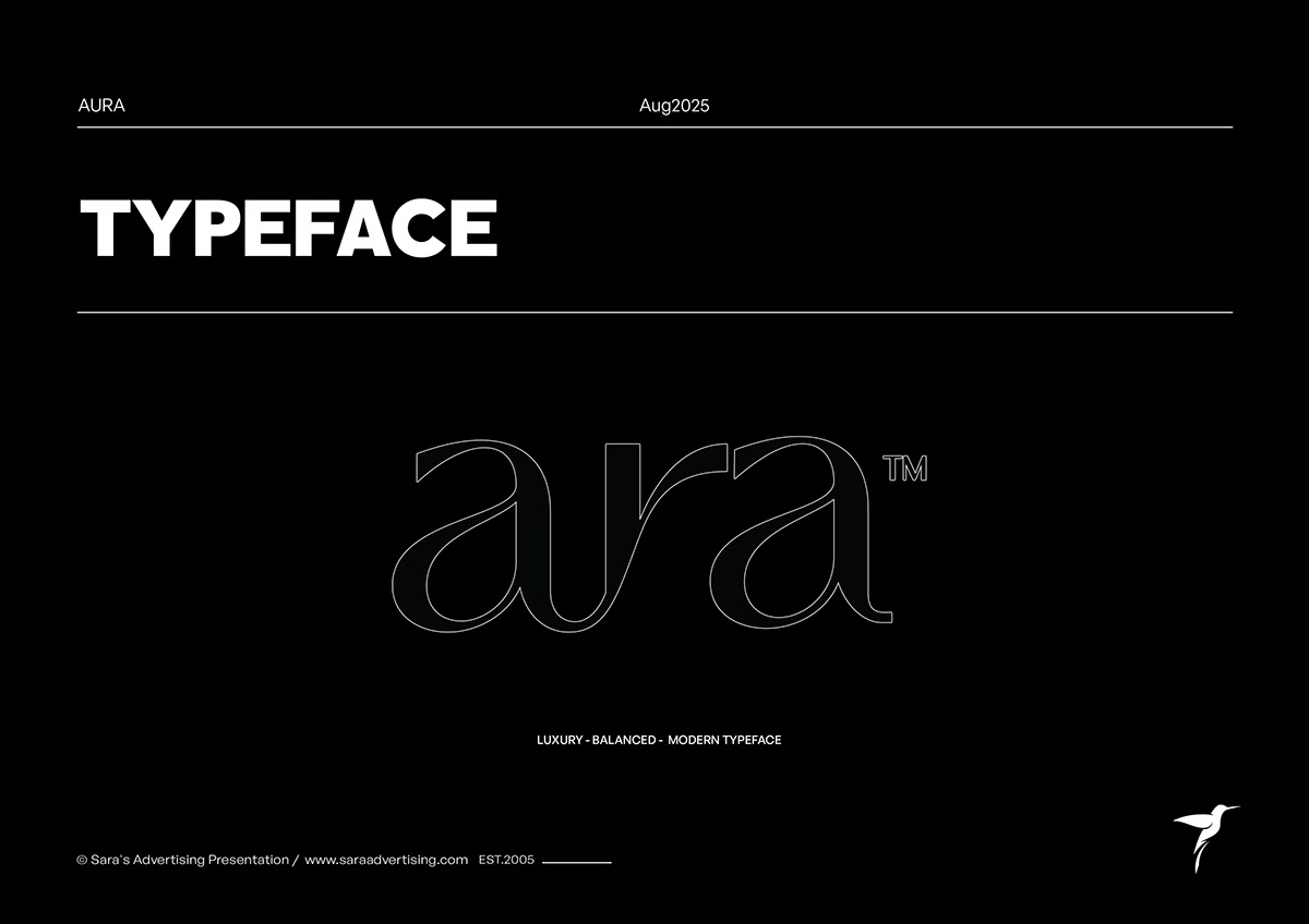 19Wordmark character
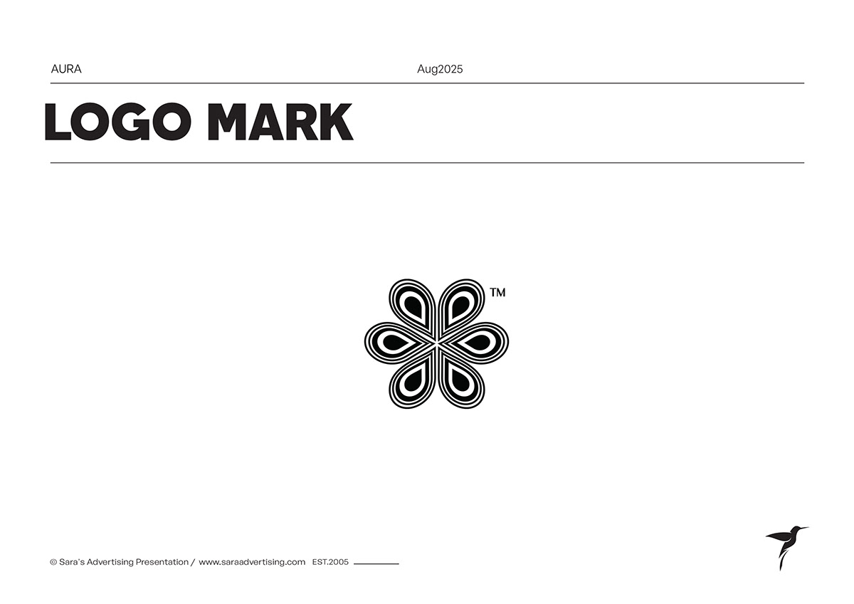 20Brand symbol
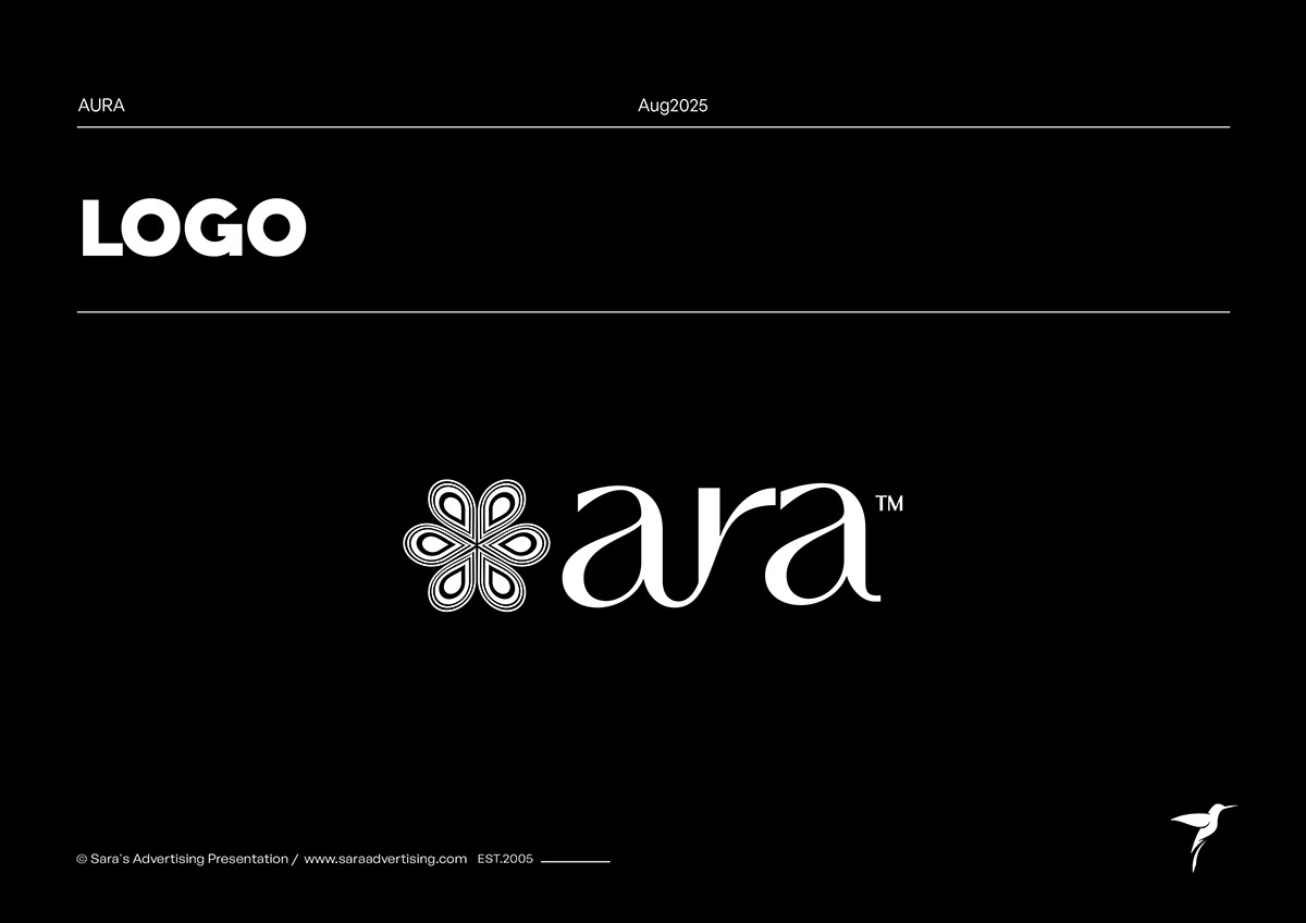 21White logo on black
 22Black logo on white
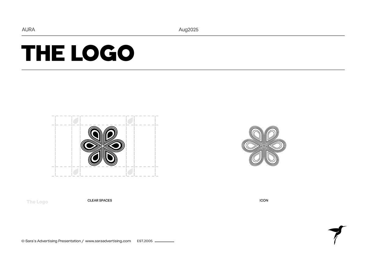 23Symbol construction grid
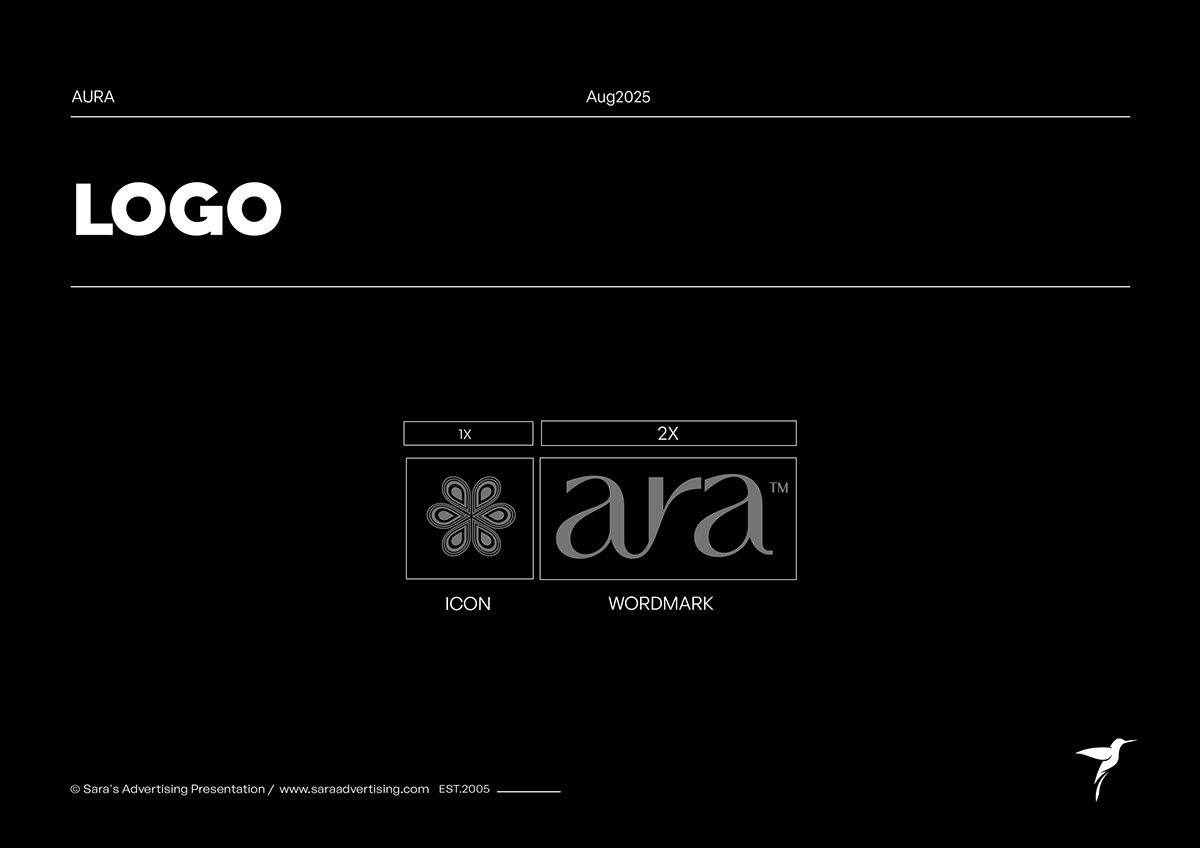 24Wordmark proportions
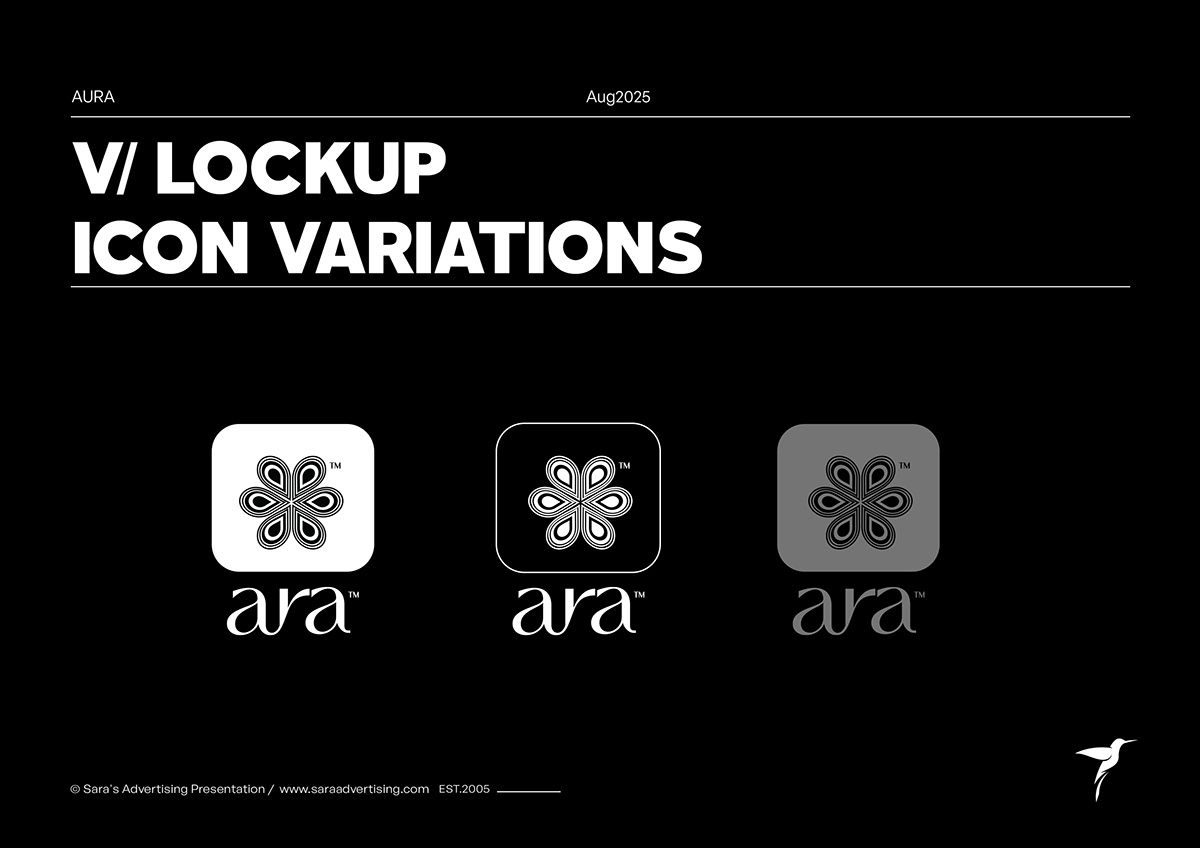 25Vertical logo variations
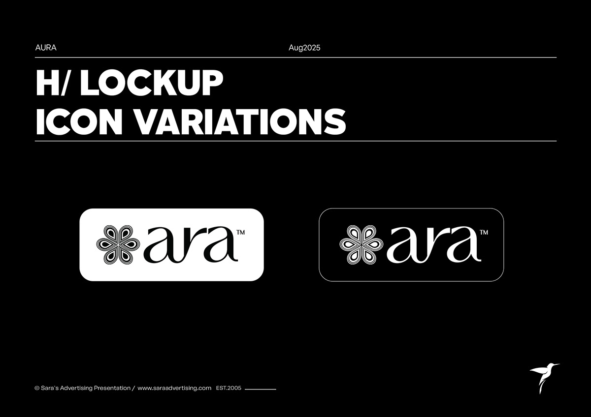 26Horizontal logo variations
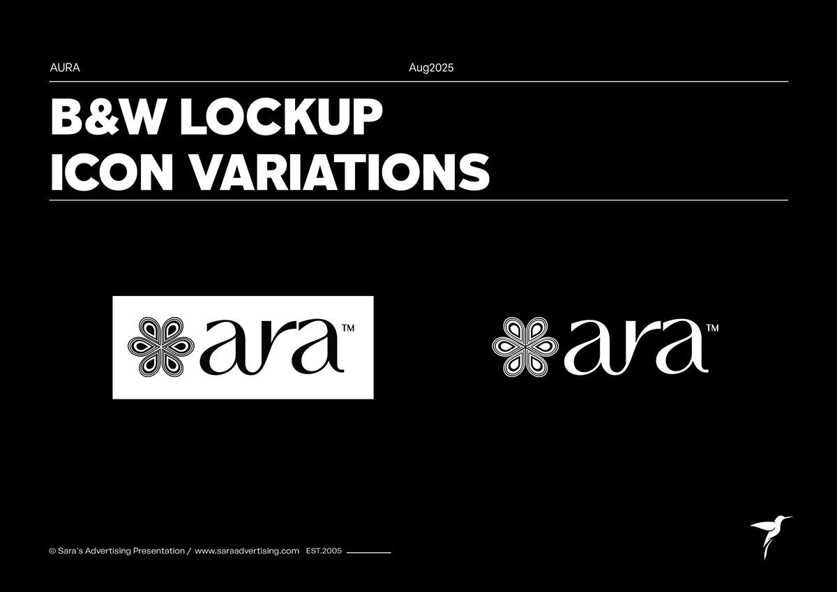 27Black-and-white lockups
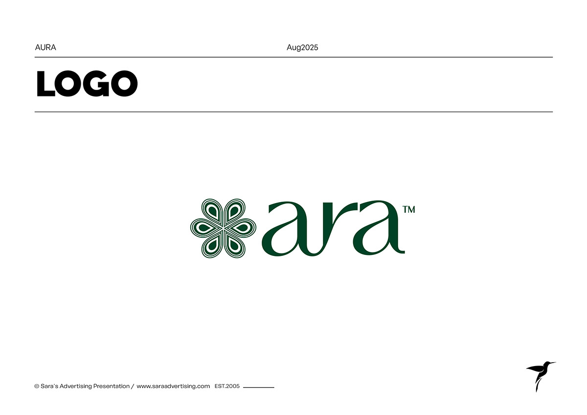 28Green identity lockup
 29Gold identity lockup
 30Green and gold identity lockup
 31Competitive logo context
 32Brand typography chapter
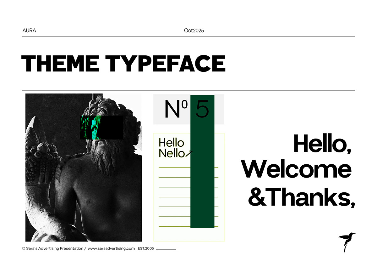 33Theme typeface direction
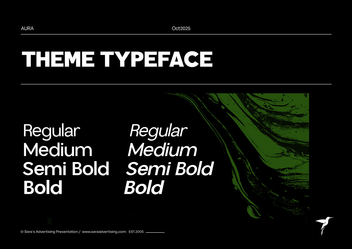 34Type weights and italic styles
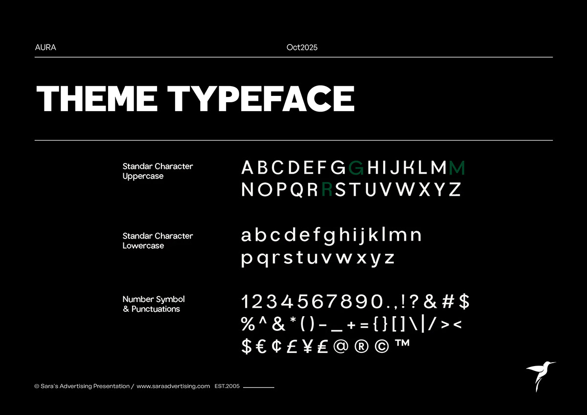 35Character and numeral system
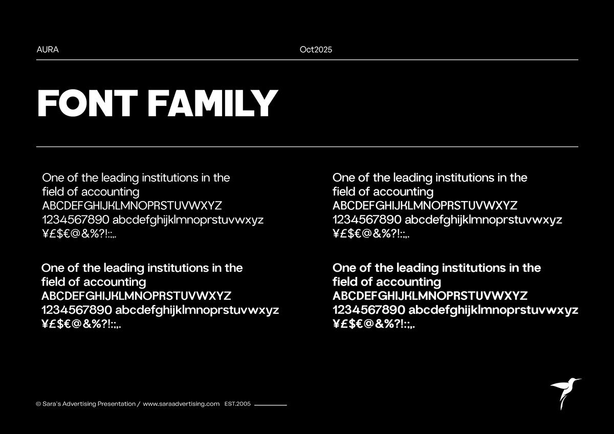 36Font family applications
 37Tagline chapter
 38Quality Inspired by Nature
 39The tagline concept
 40English tagline treatment
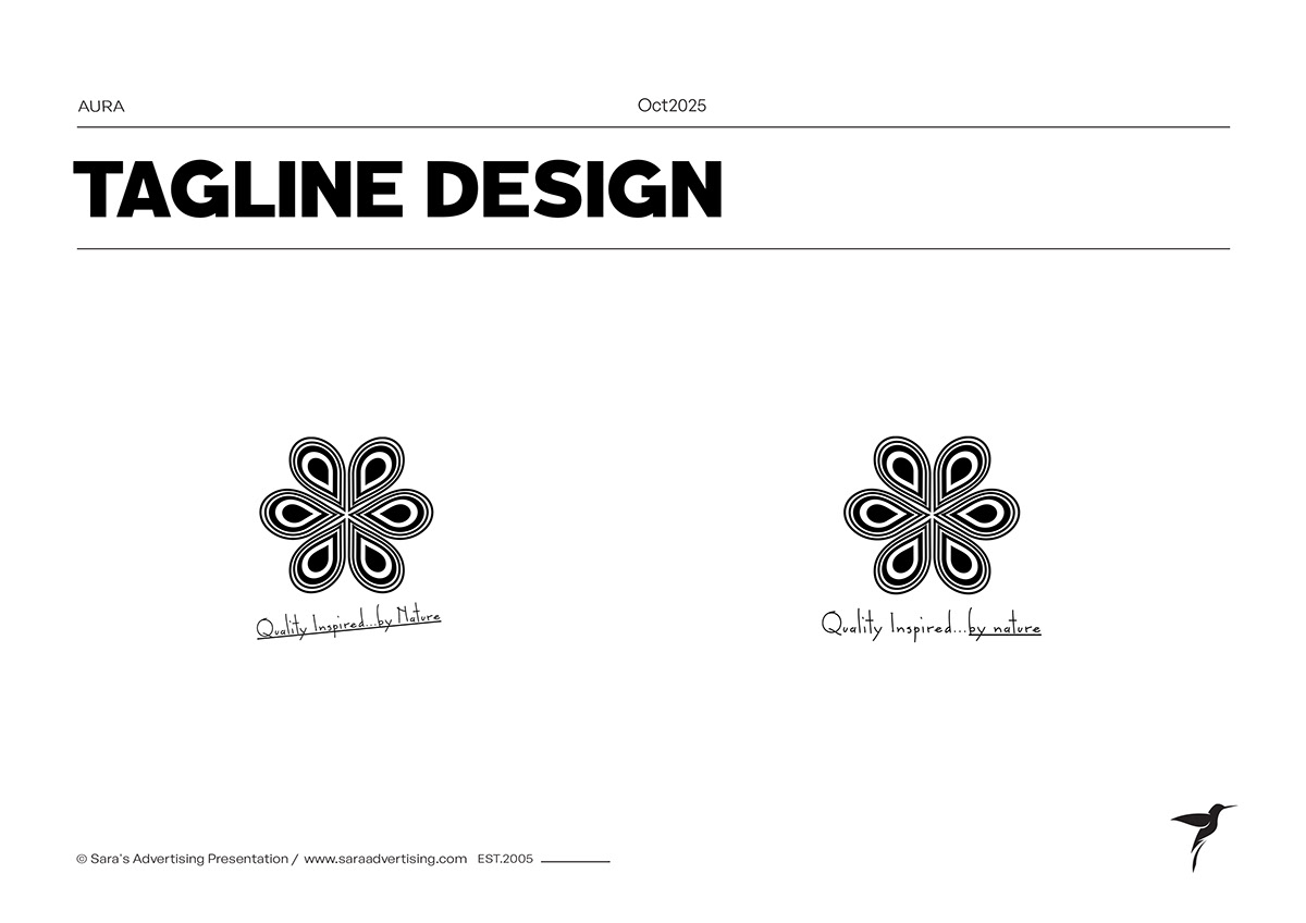 41Symbol and Arabic tagline
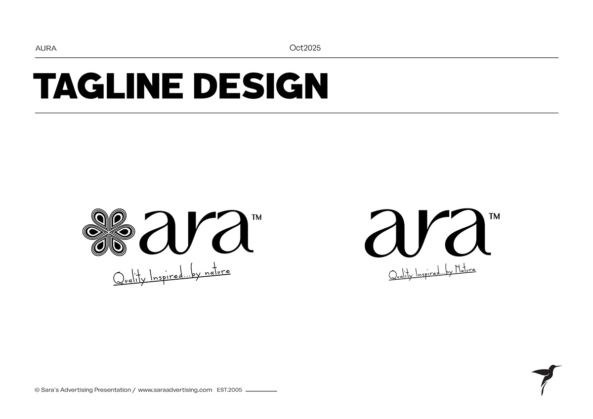 42Wordmark and Arabic tagline
 43Stationery chapter
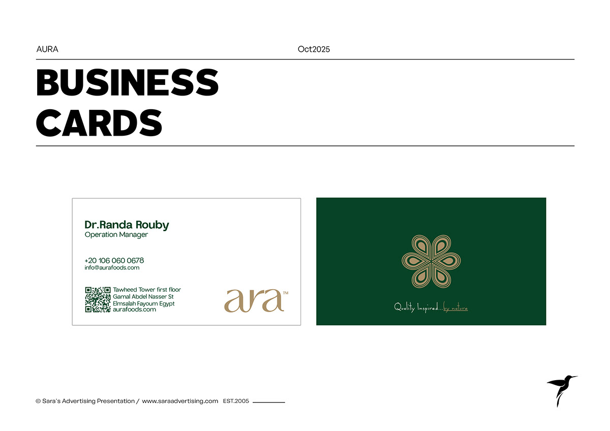 44Business card system
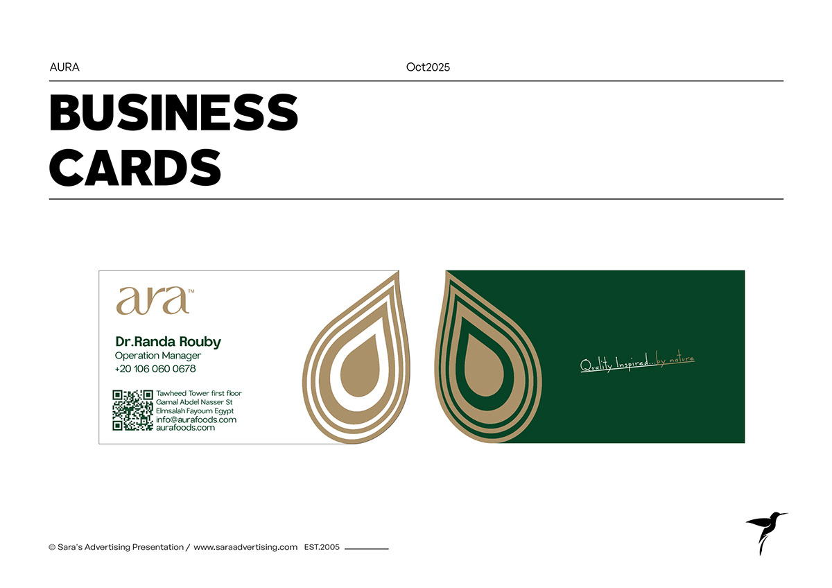 45Business card variation
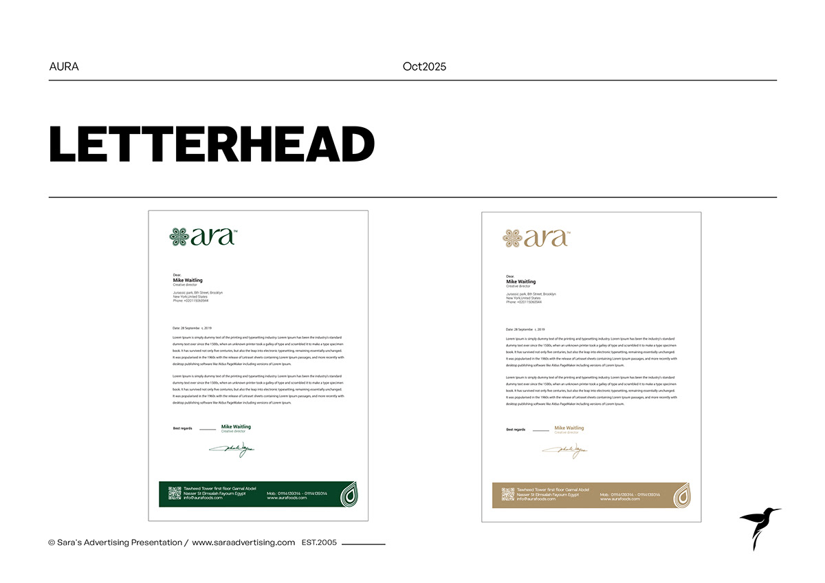 46Letterhead in green and gold
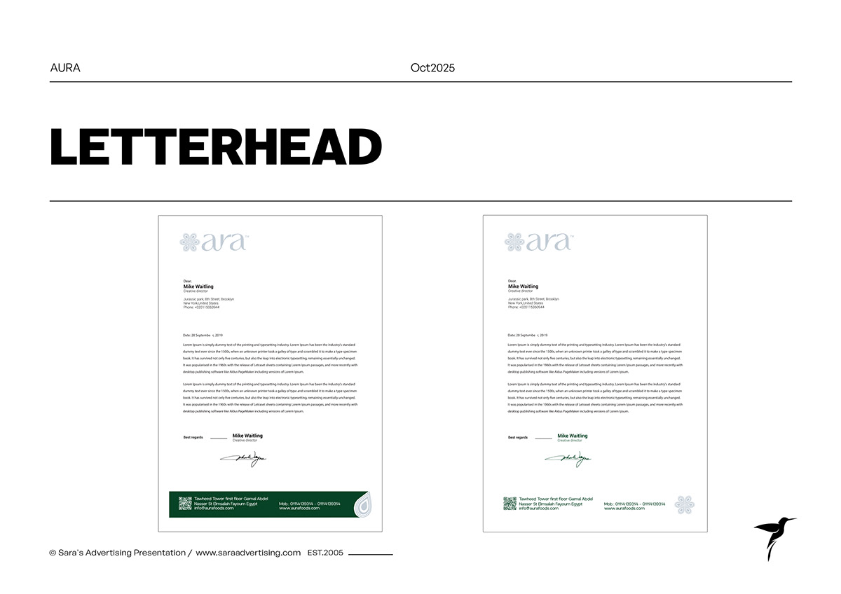 47Letterhead alternatives
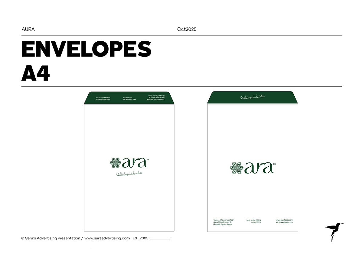 48A4 envelope system
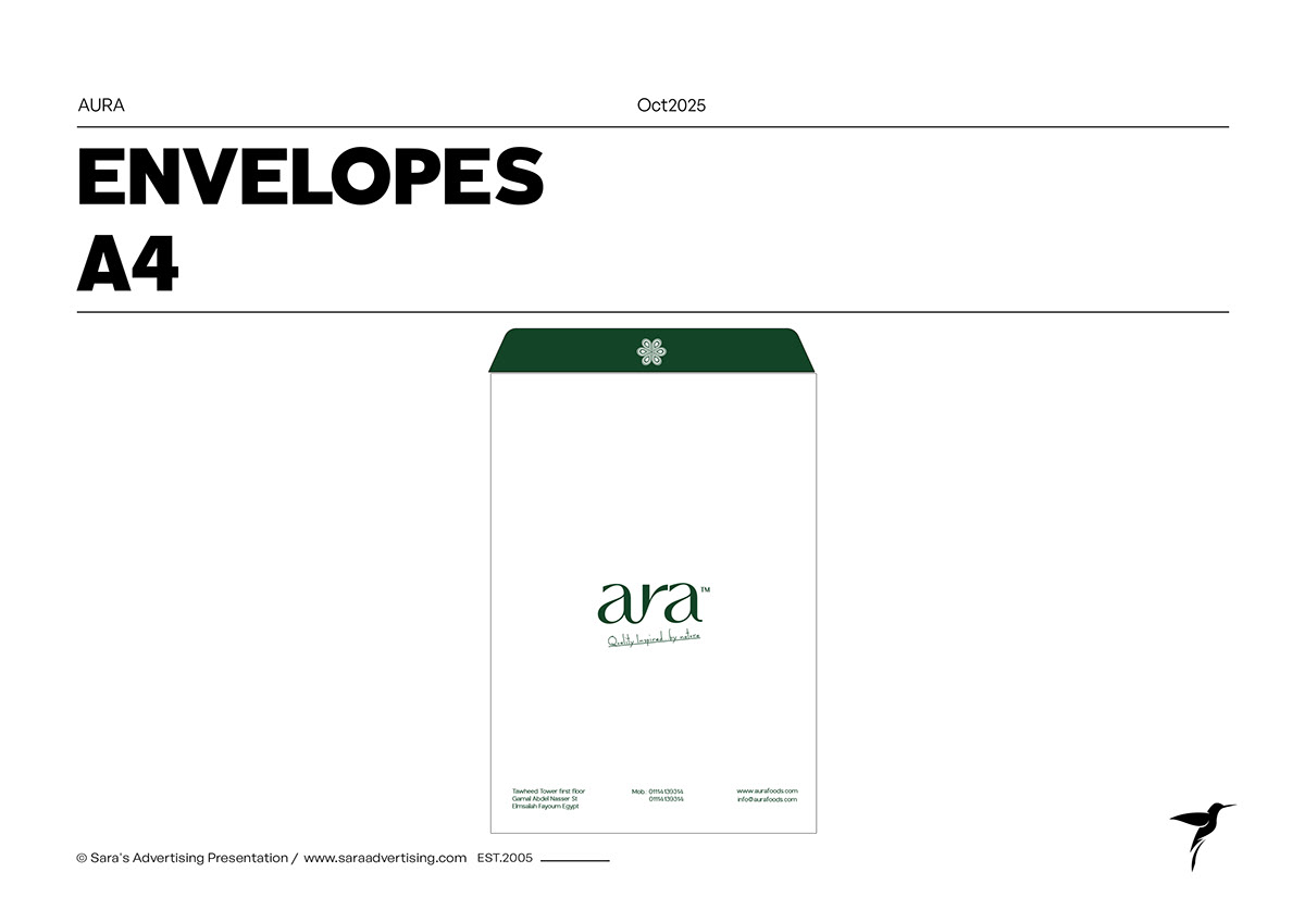 49A4 envelope layout
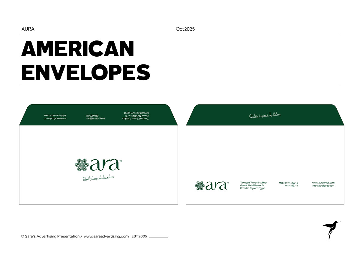 50American envelope format
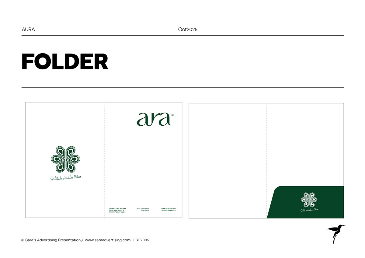 51Presentation folder layout
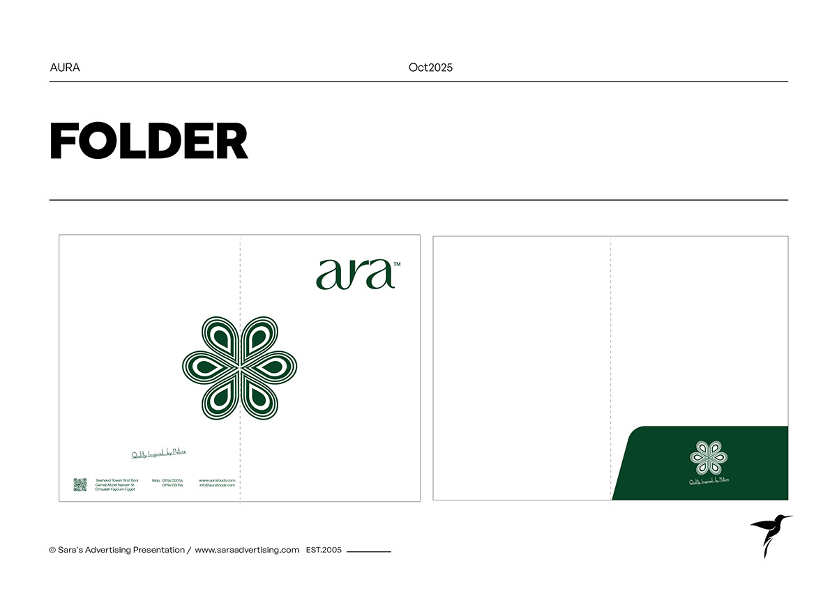 52Presentation folder variation
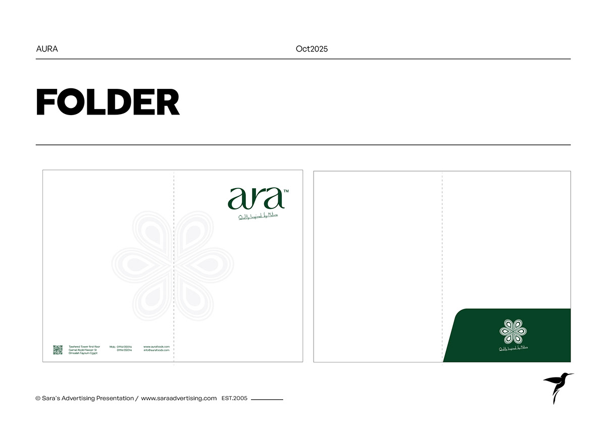 53Presentation folder alternative
 54Brand illustration chapter
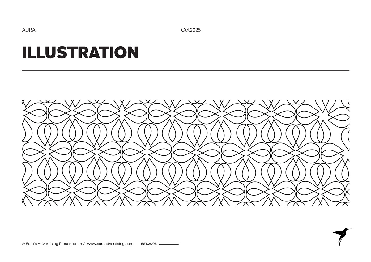 55Looped symbol pattern
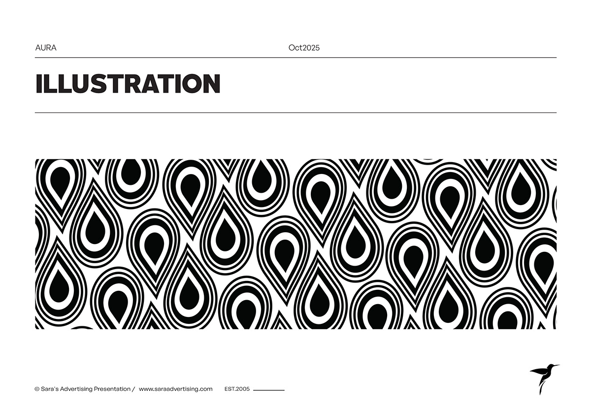 56Droplet-inspired pattern
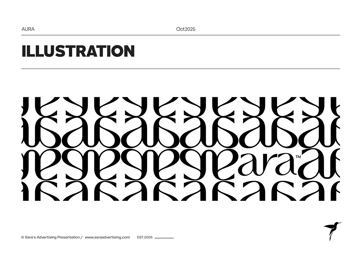 57Wordmark repetition pattern
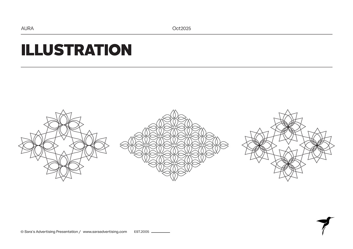 58Geometric floral illustrations
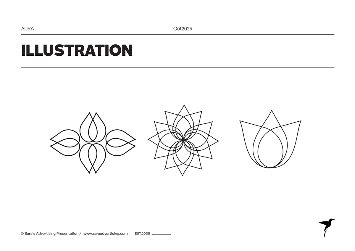 59Botanical symbol constructions
 60Brand look and feel chapter
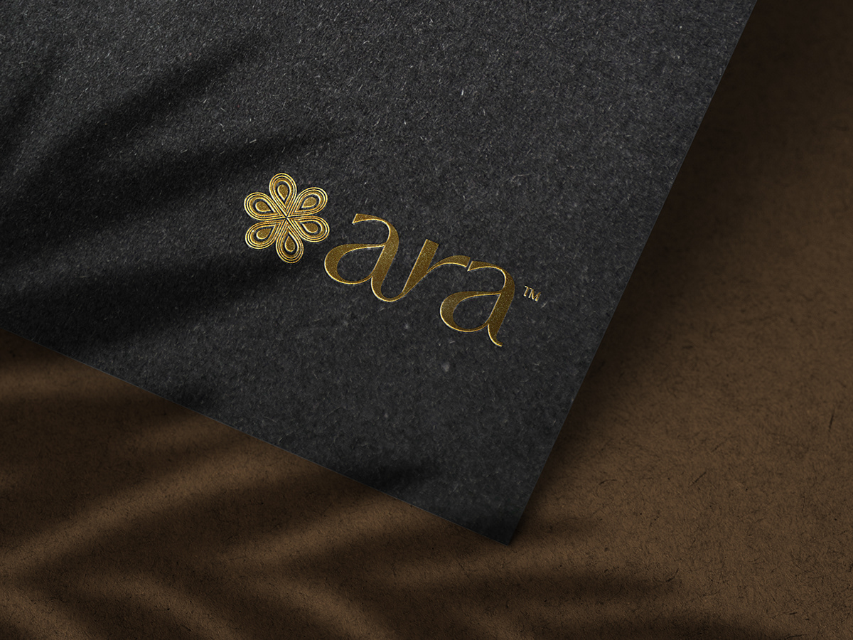 61Gold identity on fabric
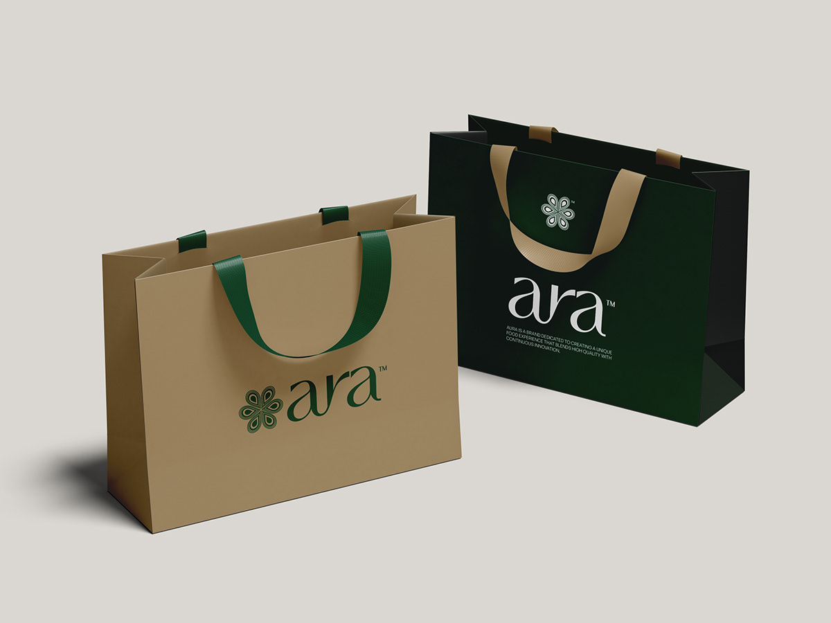 62Green and kraft shopping bags
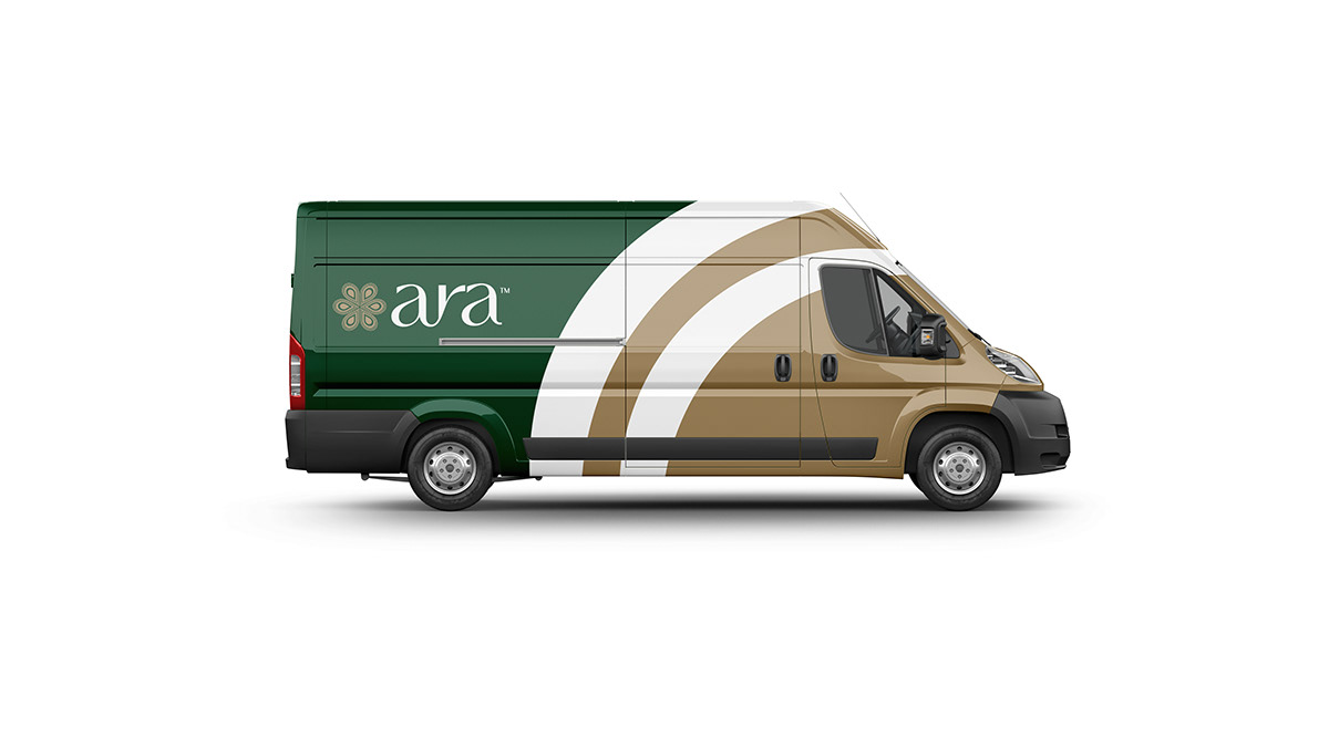 63Branded delivery van concept
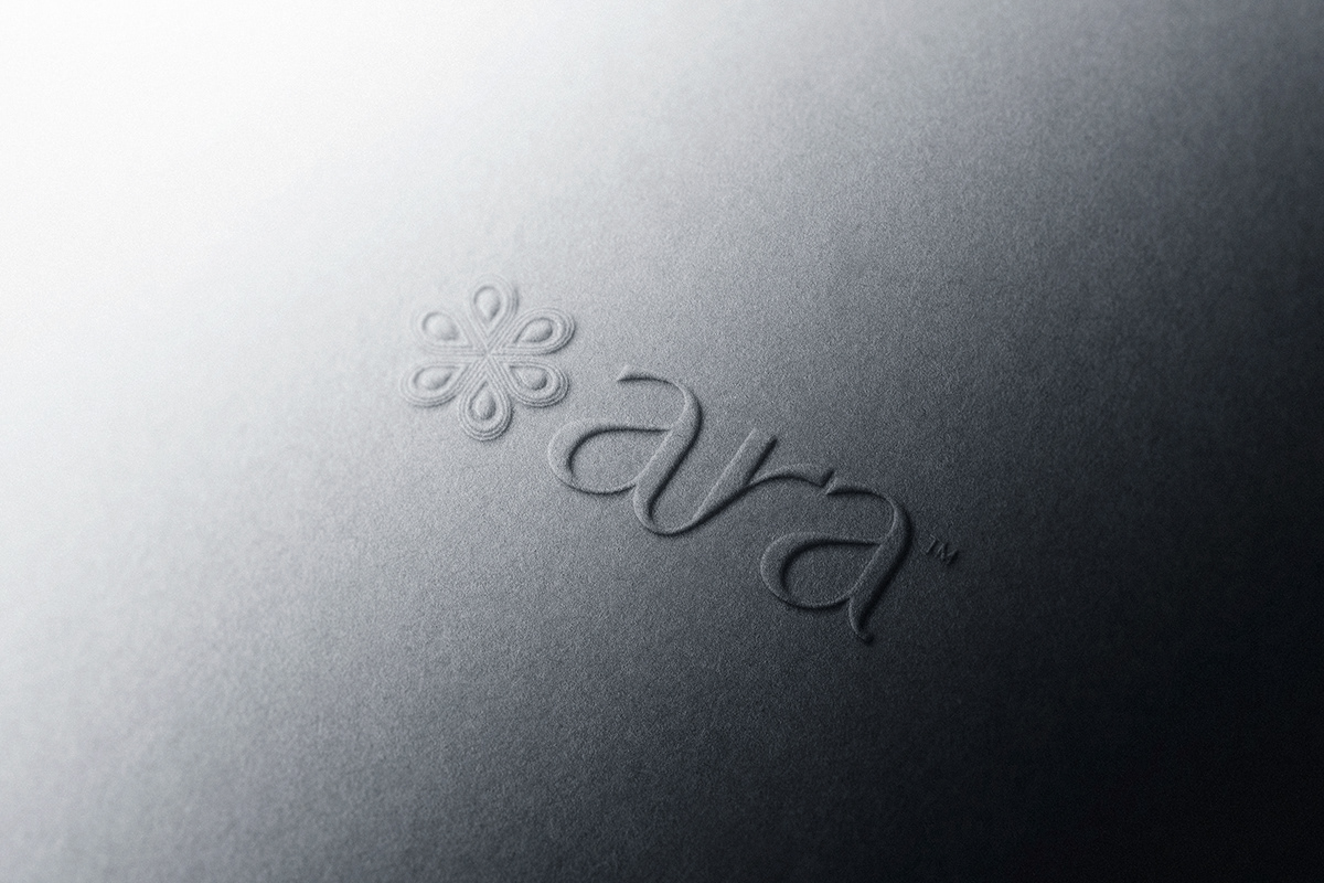 64Embossed logo application
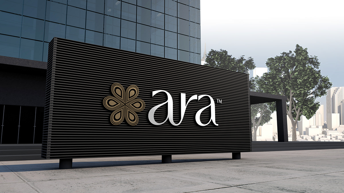 65Exterior facade signage concept
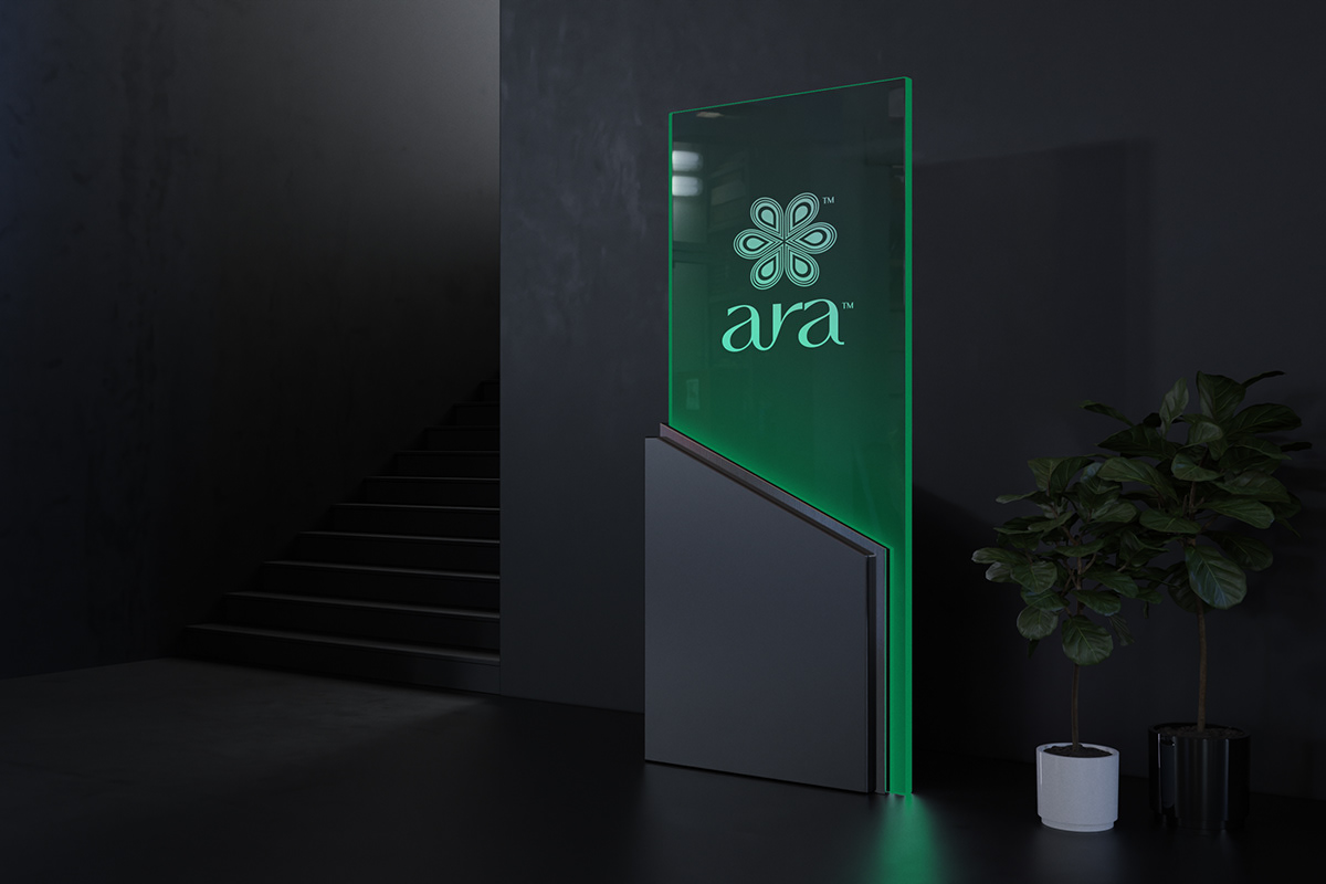 66Illuminated vertical sign
 67Branded mug application
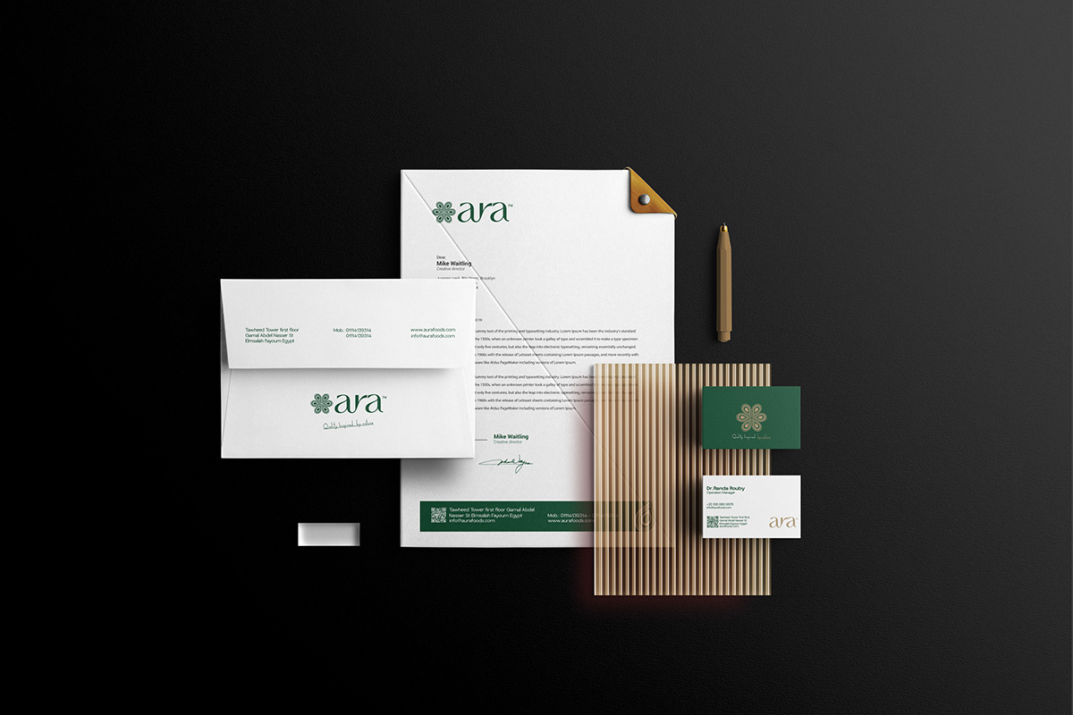 68Complete stationery presentation
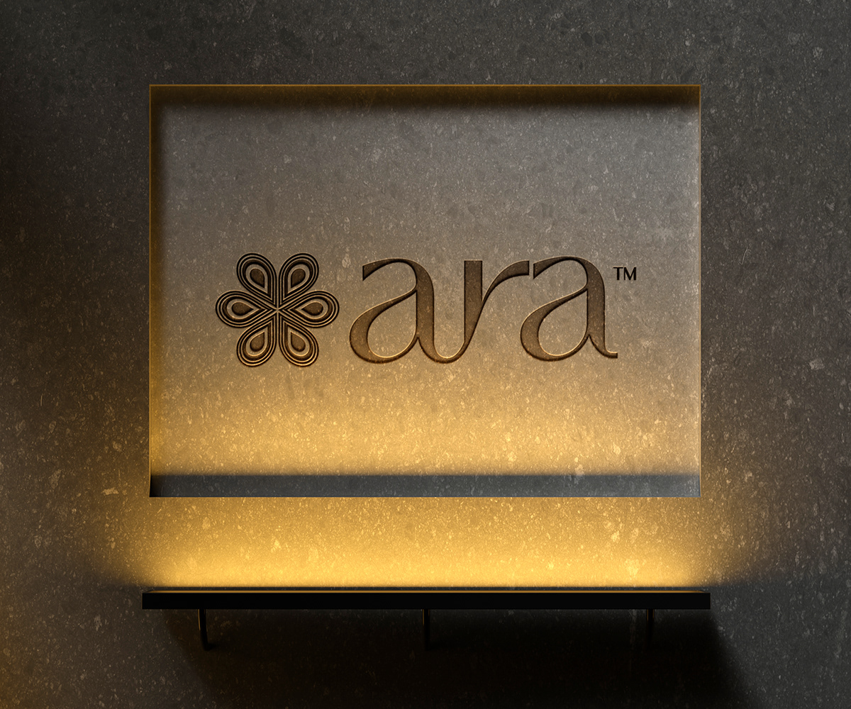 69Illuminated wall identity
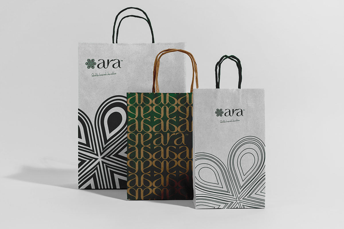 70Pattern-led shopping bag range
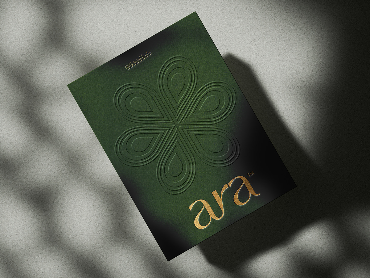 71Embossed green print piece
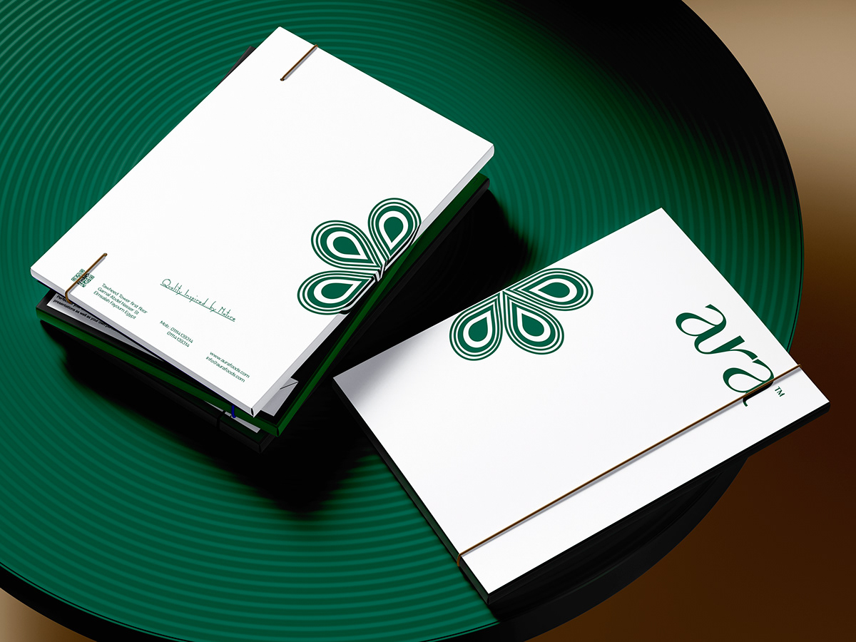 72Business cards in context
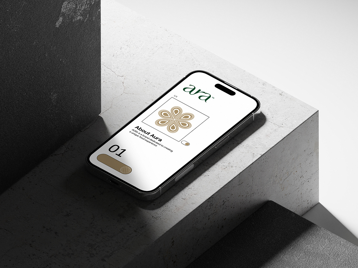 73Mobile identity presentation
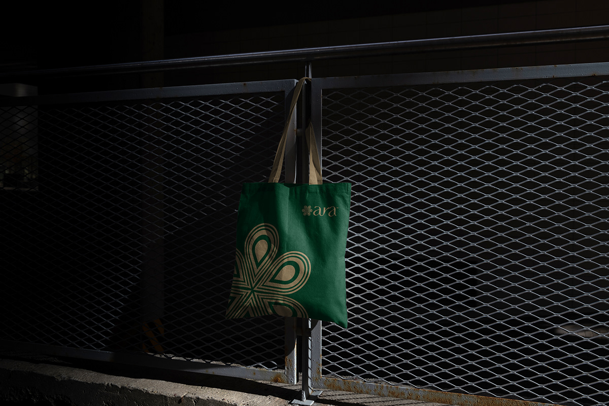 74Branded clothing application
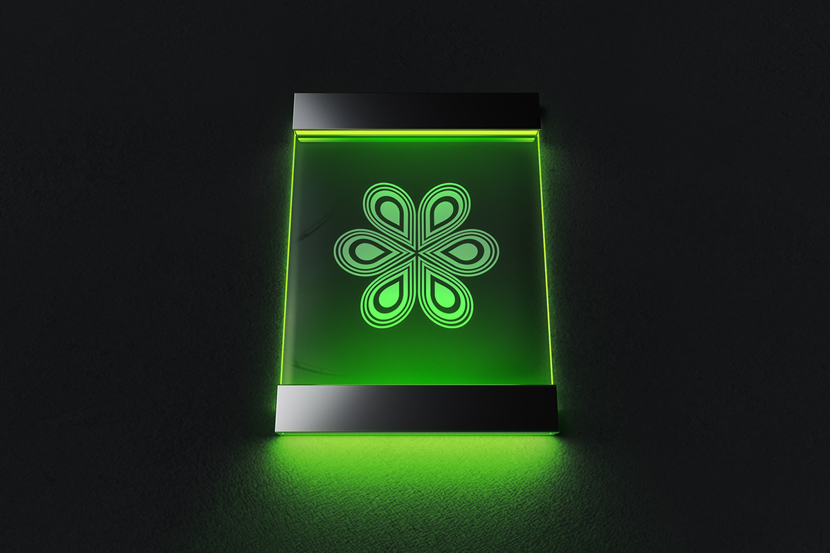 75Illuminated logo display
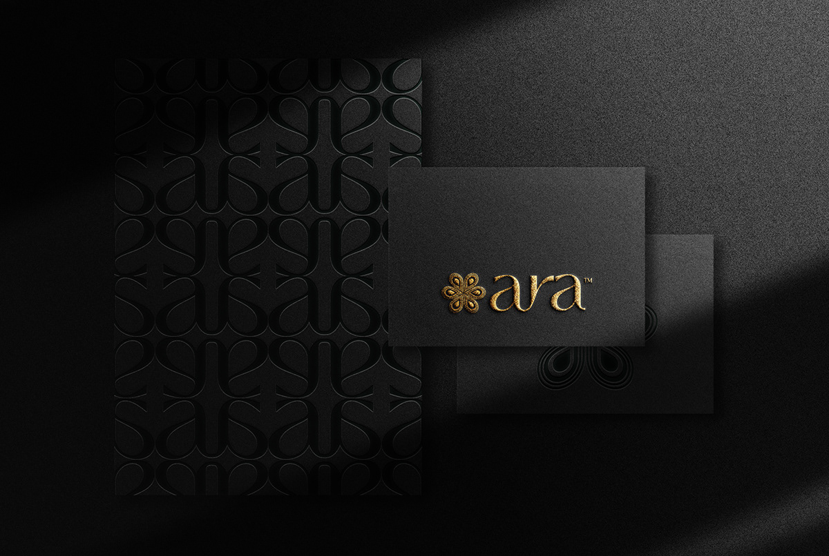 76Black embossed identity application
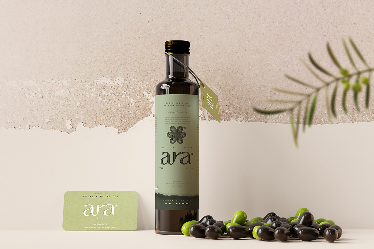 77Olive oil packaging concept78Olive oil hero presentation
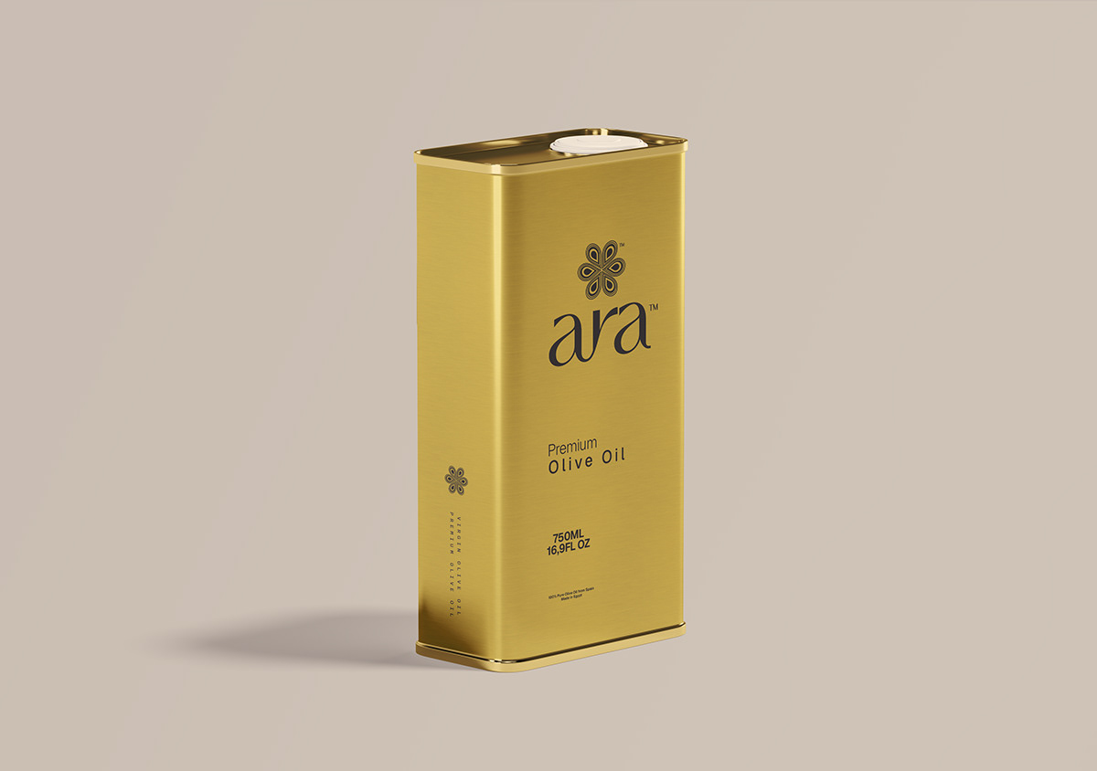 79Olive oil tin packaging concept
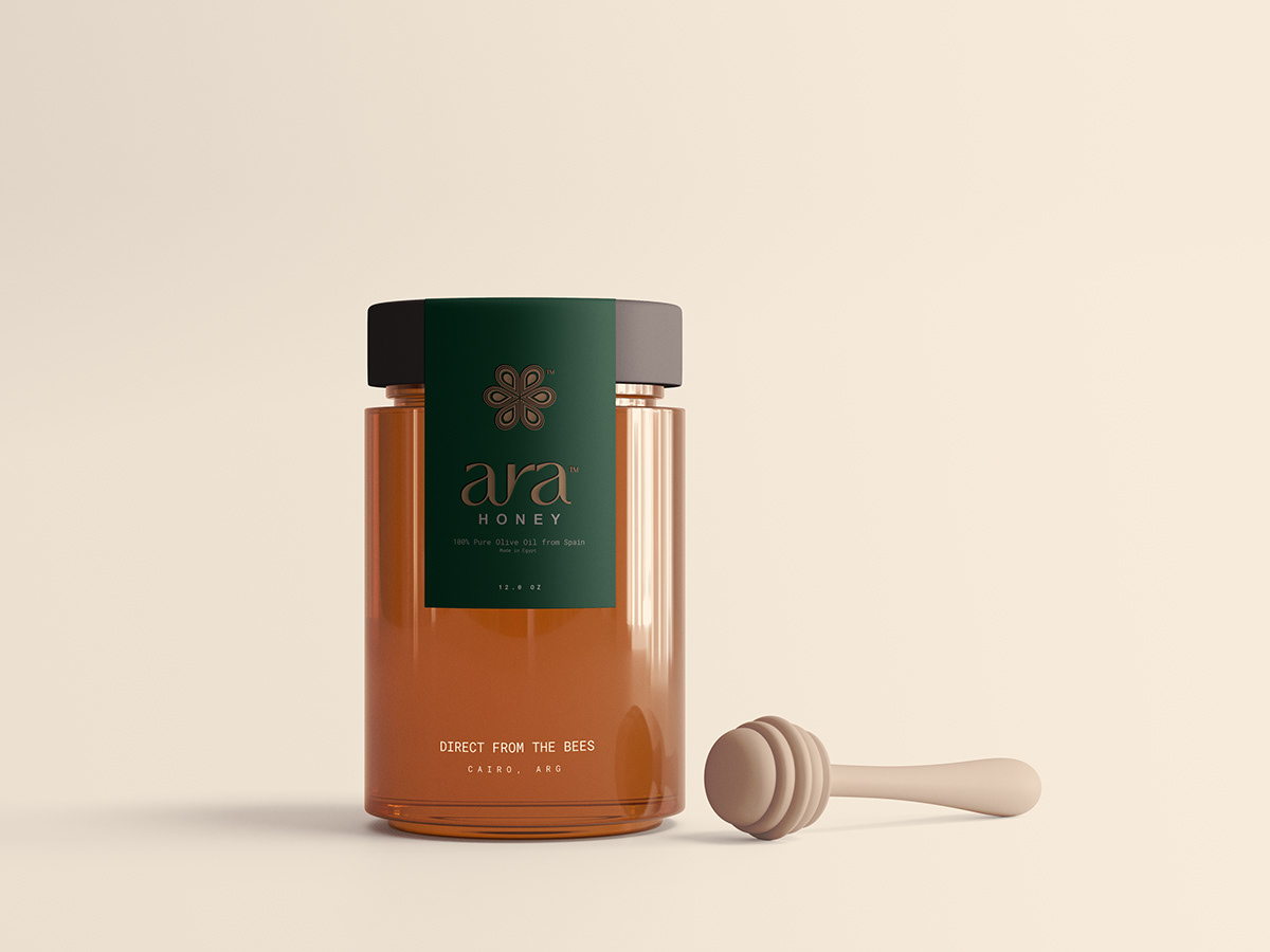 80Honey canister packaging concept
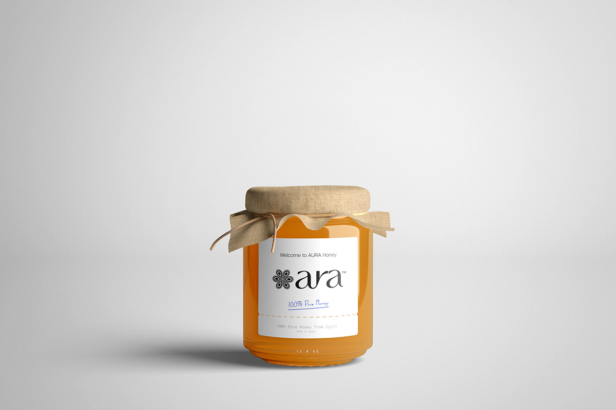 81Honey jar packaging concept
One coherent identity.
Many ways to experience it.
Brand foundations and voice. A nature-led identity. A packaging family. Patterns, stationery and application concepts. Three AI product films. The work is connected by a shared idea, with each output developed for its own role.
Build your branding & packaging brief ↗The following figures belong only to an anonymous Egyptian healthy-food store. They are not Aura results.
Sales are one number.
Efficiency is the bigger picture.
This is a separate healthy-food brand, not Aura. Here, the job was to understand where advertising money was going, what store revenue it supported and which parts of the account needed closer review.
Almost half the sales value
was going back into advertising.
Reported advertising spend was close to EGP 5 million against approximately EGP 10 million in store sales. MER was around 2: roughly EGP 2 of store sales for each EGP 1 spent on ads across platforms. The period included Ramadan and Eid.
A platform ROAS alone could not answer the business question. We needed to look at store-level revenue, the quality of visits, product performance and the amount left after product cost and advertising.
Store sales ÷ advertising spend
Read the account beneath the headline ROAS.
Search-term spend without recorded orders
Within the analysed 30-day Shopping search-term report, generic searches were taking spend without recorded orders. This prompted a closer look at relevance and intent.
Spend on products and offers without recorded sales
A bundle being discounted does not automatically make it attractive. The offer, page, purchase journey and tracking each needed review.
Conversion value from brand-name searches
Brand demand formed a substantial share of the reviewed search-term value. Separating it helps us understand what the blended report is actually describing.
These are findings within the reviewed search-term and product reports. Their spend may overlap; they are not percentages of every channel or proof that one change caused a later result.
Separate the intent.
Review search terms, brand demand and relevance. Documented actions included negative keyword additions on 7–8 September and separating brand search for clearer analysis.
Question the offer.
Classify products and bundles for investigation or further testing. Review price, perceived value, the product page and purchase tracking before making a budget decision.
Connect traffic to revenue.
Read the store’s sales and visit data alongside advertising reports. More visits matter only when their commercial contribution supports the business objective.
What the reported periods show.
| Metric | Jan–May | 24 Aug–15 Sep |
|---|---|---|
| Advertising spend | ~EGP 5M | ~EGP 404K |
| Store sales | ~EGP 10M | ~EGP 1.149M |
| MER | ~2.0 | ~2.84 |
| Ads / store sales | ~50% | ~35% |
| After product cost + ads* | ~30 / EGP 100 | ~45 / EGP 100 |
*Based on the reported 80% product gross margin. Excludes shipping, packaging, salaries, fees and other operating costs; this is not net profit.
Less pressure from advertising.
A larger amount left before other costs.
On the reported assumptions, advertising’s share of sales moved from about 50% to about 35%. That left approximately EGP 45 per EGP 100 after product cost and advertising, compared with about EGP 30 previously.
Average daily advertising spend was about 46% lower than the January–May average. The periods differ in length and season, so this is a contextual comparison—not a controlled test.
Fewer visits.
More revenue per visit.
Compared with the immediately preceding 23-day store period, visits fell about 64% while sales fell about 6%. Revenue per visit rose from around EGP 11.5 to EGP 30. The improvement here is efficiency, not growth in total sales.
Our role: turn reports into better questions and defined actions.
Look at search intent, product economics, measurement and the customer journey together. Keep platform-attributed revenue distinct from store sales, and validate the effect of changes against an appropriate baseline.
Discuss your F&B performance ↗A new food brand?
Make the identity and packaging work together.
Build the right scope
for your next stage.
For food and beverage businesses in Egypt and regional markets, the right starting point may be a new brand, a packaging range, a content brief or an e-commerce performance question.
01Food & beverage brand strategy+
Clarify the audience, category, positioning and brand message. Define the direction that identity design, packaging and content should express. The output is an agreed positioning direction, message hierarchy and creative brief that later design and content decisions can refer back to.
Explore food and drink branding ↗02Brand identity & packaging design+
Develop the logo, colour and typography system, usage guidelines, patterns and product-range applications. Food packaging design can cover different formats and variants, with production requirements agreed in the brief. We organise the range, define the hierarchy between brand and product information, and prepare the application rules needed for consistent future work.
Explore packaging design ↗03Food product photography, video & AI content+
Turn product features and usage occasions into content. The scope may include product photography, commercials, AI-generated product videos, motion graphics and social adaptations, subject to the agreed production approach. We define the concept, product references, script or scene structure, visual direction and required platform formats before production.
See the Aura AI product films ↗04F&B websites & e-commerce experiences+
Organise product ranges, brand stories and contact or shopping journeys into a responsive website. Website design is scoped separately around your content, platform and customer journey. That means deciding how visitors discover the range, understand the brand, find product information and reach the next action.
Explore website design and development ↗05Food & beverage digital marketing+
Plan content and paid-media activity around the commercial brief. For e-commerce, review search intent, product performance, tracking and the buying journey alongside the ad-platform metrics. Agree the conversion definitions, reporting periods and review rhythm so decisions have a consistent evidence base.
See the separate food e-commerce account review ↗Clear decisions.
Connected delivery.
You do not need every service at once. We identify the priority, agree the outputs and build the work around your stage, product range and market.
Diagnose
Review your products, audience, market, assets and business challenge. For a performance brief, include the store and reporting context.
Define
Set the direction, deliverables, responsibilities, application list and review stages. Make the approval criteria clear before execution.
Develop
Build the agreed identity, packaging, content, website or marketing work. Review decisions against the brief and the way the assets will be used.
Implement & review
Prepare the approved assets and integration needs. Where marketing is in scope, review the agreed measures and use the findings to guide the next cycle.
Start with
the right questions.
What does an F&B branding project include?+
A scope can include brand strategy, verbal identity, logo and visual identity, brand guidelines, packaging concepts and launch applications. The Aura case demonstrates how those elements connect; your deliverables are defined around your own brief.
Can you redesign food packaging without changing the whole identity?+
Yes. We can review the existing identity and product range, then scope the packaging work it needs. Any changes to the logo, visual system, copy or production files are agreed before development.
Can AI product videos work with our existing brand?+
They can be scoped around the approved product references, packaging and visual direction. Product accuracy, production approach, formats and approvals need to be defined in the brief. The Aura films show examples of the output.
Do you handle food e-commerce marketing as well?+
Sara offers digital marketing and account review alongside creative services. We define the campaign and measurement scope separately from the identity or production scope, so creative outputs and commercial outcomes are assessed with the right evidence.
What should we send to get started?+
Your brand name, product range, market, current packaging or website, the challenge you want to solve, launch timing and an approximate budget. Existing guidelines, dielines and product photography help define the work.
Give your food brand
a clear next chapter.
Launching something new?
Developing how your products look?
Reviewing your marketing performance?
Send your product range, market and current challenge.
We’ll discuss the branding, content or marketing scope you need.